May 29, 2008
Strange Nail Polish Advertisements
Some nail polish brands like OPI have consistently excellent marketing and advertisements. OPI ads always have one classy very beautiful model with very well manicured visible nails – simple and chic.
Then… some… brands… well I just don’t know.
Polish Addict’s Exhibit 1: CND Plexi Pop Collection.
 I don’t get this advertisement. Actually, I don’t get this entire collection. What exactly is a plexi? Do they mean plexi as in ‘plexi glass’? Is it called plexi pop because it’s like colored glass? If that’s the concept… then what’s up with the Jetsons styled model? Does plexi glass relate in some way to bad futuristic make up and hair? This promotional image doesn’t make me want to buy nail polish. It makes me bitter that it’s 2008 and we still don’t have flying cars.
Exhibit 2: Orly Love Collection

Plexi pop is a failed marketing concept but it was a good try. The ad for the Orly Love Collection, on the other hand, is an example of how some people are just plain bad at their jobs. I’m not a make-up girl, so I’m not really qualified to pass judgment, but really, this model looks hideous. Did it really not occur to anyone at any step in the creation of this abomination that this make-up is ugly? I mean… first the make up artist, the photographer, the lighting person, the set designer, the person who edited the image… the execs who agreed that this image was THE ONE for this ad – is it really possible that, no one, n-o o-n-e along the way was like, “hey Bob, you know, maybe… maybe we shouldn’t use this ad. This girl… she doesn’t really look like she’s in love, unless being in love makes you look like you’re dying of hypothermia.” Take my criticism with a grain of salt because, like I said, make up isn’t my beat. I do know nails though, and I don’t like the nails in this ad either. They just look bad. The color looks fine but the shape and curvature of the nail bed is unattractive and weird. Get. A. Hand. Model. Orly, c’mon, you can do better.
And finally, Exhibit #3.

I lol every time I see the We Adorn You ad. I don’t want to give China Glaze a hard time because usually they have excellent promotional images. This ad is definitely an aberration, but wow, when advertising goes wrong, it really goes wrong. I get the concept here. “We Adorn You”, so we need an image of pampered, well-groomed women in China Glaze nail polish – ok, solid up to that point. The wrong turn occurred when China Glaze decided it would be a good idea to hire a porn industry hair and make-up artist for this shoot. I mean no offense to these three models, they’re beautiful, but this ad looks like it could be interchangeable with a softcore porn video cover or something else equally cheesy. I actually have a sneaking suspicion that China Glaze might have recycled a harlequin romance novel cover for use in this ad. The story was about 3 concubines that ran away together from an evil King’s harem. This is the cropped version of the image. The full image includes Fabio, ripped shirt, hair blowing in the wind.
May 28, 2008
Variations on a Theme: The Traditional Essie French Manicure
I know I’m in the minority when it comes to love for french manicures. I even like french for… *gasp*… pedicures, blasphemy, I know. In hopes of convincing more people to come to the dark side (rather the light pink and white side), I decided to do a series on the various types of french manicures. We’ll be looking at different polishes that can comprise the set as well as different application styles and looks. Today, we’re looking at, what is in my opinion, the quintessential french manicure: The Traditional Essie French Mani.
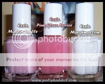
When it comes to demure, but sophisticated, nudes, pinks, and neutrals – Essie is the go-to brand. To me, Essie is also synonymous with french manis. I’ve tried several french mani combinations, nothing compares to the look you get with Essie Mademoiselle and Essie Marshmallow. Most people would refer to this combo as being an American French Manicure. (For an explanation for the differences between french mani styles check out this link.) The combo is soft and natural looking, definitely among my personal favorites but also widely popular with just about everyone who like french manis. Essie Pink Glove Service can also be used as a base color for a french mani but here I used it as the over-layer. Generally, I like flashy stark white tips but since I’m temporarily stuck in realm of professional looking manis, I decided to layer Pink Glove Service to dim Marshmallow a bit. I like the way it looks but ultimately I could have done without the extra PGS coat because Mademoiselle and Marshmallow look very professional all on their own.

As far as application: This is base coat plus one coat of Mademoiselle, perfectly smooth and even. Mademoiselle looks very pink in the bottle but applies translucent. I needed two coats of Marshmallow for the tips to look solid. I did this free hand so, as you can imagine, it was a huge pain in the butt. Stickers are great but they work best for the very patient. I find it easier to just do it free hand. Doing free hand correctly takes some practice but that’s better than fumbling with the stickers. The nail board wisdom tip for getting a good solid white tip is too move your finger instead of the brush, that’s also what works best for me.
May 27, 2008
New York Times: Ok, Really – Just Never Report On Nail Polish EVER AGAIN
I meant to write about this the day the article was published but life gets in the way of blogging. So here it is, albeit a bit late, my rant on the lameness of this article:
At first, the article was so ridiculous to me that I thought it might have been satirical or tongue-in-cheek, but sadly, I think the article is actually being serious. It’s not the actual chipping that bothers me, it’s the attitude of the self important people quoted and discussed in the article. One of my nail polish philosophies is that you should wear polish however the hell you want, whenever the hell you want. So if you don’t mind having chipped polish, cool. If you follow trends, cool. If you only wear pink and red, freaking cool – as long as *you* like it, more power to you. This article attempted to explain that in modern America liberated women can choose to care about nails or not care at all, either way garnering acceptance. Great message, but the article managed to miss that boat completely and instead captured a snap shot of everything that is wrong with our society. (Sorry, NY Times but Lindsay Lohan and co. will never be good feminist role models regardless of how liberating their chipped nail polish may be.)
Apparently, ultra-wealthy people/chic people are too cool or too busy to have nice nails (you know cause shopping, partying, and grooming is really time consuming), so their chipped gross nail polish, plus $5,000 bag and shoes, stand symbolically of how much better than you these people happen to be. All the people interviewed in the article say things like, “oh well ugh I just don’t care.” The article treated “not caring” as being synonymous with being, like, totally super cool and, like, totally awesome. I ask, if you really don’t care then why even wear nail polish. More importantly, if you REALLY “don’t care” about your appearance, why spend thousands on expensive clothing, accessories, and grooming sans nail care? The girls on the nail board echoed my view as well, the girls summarized the article as basically standing for the proposition that “if you’re rich, young, and pretty, you can do whatever you want and it’s going to be interpreted as ‘cool’.” Like I’ve said, you can do whatever you want with your nails as far as I’m concerned, but I’m definitely not going to follow a trend I don’t like just because some celebutant is doing it. Sorry, but I think most socialites/celebutants are undeserving worthless dead weight, drains on culture and society, and I’m not giving them any brownie points for not “wanting to be perfect” or being too busy/too cool/too important to care about their nails. I hope no one was unduly influenced by that article.
Final note: The most annoying thing about this article is that the author got the likes of Ji Baek and Deborah Lippmann to weigh in on the trend with their toooootalllly unbiased opinions… um really? The owners of two of the most expensive polish lines on earth think it’s okay for socialites to have chipped nail polish. Kill. me. now. please.
May 26, 2008
Orly Love Collection Swatches
First a personal update: I want to apologize to my loyal readers, I haven’t been updating often. I moved in with my family for the summer to do an internship. The way our internet was set up, I had to write all my articles in my 14 year-old little brother’s room. My brother spends all his time playing massive multi-player online games, which means all my articles had to be written to the tune of my brother screaming at his teammates on his headset. I couldn’t take it anymore, so I bought my family a wireless router. Now I can write in peace, expect more updates and please stick with me. ; )
And now for my thoughts on Orly Love Collection: NOT IMPRESSED. Generally, the colors have ok application, not streaky but almost none of the colors were flattering. Most of the colors are translucent at 2 coats, so if you’re like me and don’t like translucent colors, you’d need to use 4+ coats to get bottle color – but 4 coats = bubble hell.

On my eternal search for wearable off-whites, I had high hopes for Orly My Beau. It’s a white eggshell type color. It’s not unattractive per se but the yellow tones in it looked weird with my skin tone. This swatch is 4 coats, you can’t see the bubbles in the picture but I assure you that they are there.

At two coats, Orly Dream Boat would probably be a good french mani color. This swatch is 4 coats, same issues with bubbles. And again, it’s just not flattering for my skin tone.

Someone on MUA compared Orly Secret Admirer to a creamsicle, that’s the perfect description for this color. This swatch is 4 coats. Again, this collection just really wasn’t meant for people with my skin color.

Orly First Kiss was one of the fan favorites from this collection. It’s the only color from the Love Collection that I’ve worn as a mani. Again, the color, that I describe as a ‘dead’ pink for it’s lack of luster, did nothing for my skin tone. I wore it for 3 days and it still did grow on me. I have seen people with lighter skin tones wear it very well but there are better light pinks out there for us darker girls. Using only two coats, it would probably work better for french manis, but why bother when you can get Essie Mademoiselle instead.

I actually don’t have anything negative to say about Orly Crush on You. It’s a great orange with great application, this swatch is 2 thick coats.

Orly Butterflies and Orly Crush on You are the two stand out colors from this collection. Butterflies had great application, the swatch is 2 thick coats. This hot pink is very vivid – both Butterflies and Crush on You are great colors for summer and spring.
May 19, 2008
Comparison Swatches: Neon Purples

In my infinite nail polish nerdiness, I somehow ended up three neon purple polishes. Well, four actually, I didn’t include China Glaze Flying Dragon in the comparison because it’s unique enough that everyone should own it, regardless of whether one owns other neon purples. The image above is misleading, Color Club Power Play and New York Summer Super Violet aren’t as magentish in person as they are in the picture and both look very similar to Zoya Juicy in the bottle. My favorite of the three is definitely Power Play. It only took 2 coats to get bottle color, while the other colors took 3+ coats. Super Violet is a close second. Both
Super Violet and Power Play are high quality and incredibly affordable. My personal opinion is that they are similar enough that owning both is probably not justifiable. Juicy is meh… but of course, I’m biased because I’m predisposed to disliking Zoya. It is no surprise that I was not impressed by Juicy.

These swatches are in direct sunlight. New York Summer Super Violet took 3 coats, Color Club Power Play took 2 coats, Zoya Juicy took 4 coats (note the cuticle drag). All these colors dry somewhat matte so I also added a layer of Color Club Vivid top coat.
Which color do you guys like best? Do you have a favorite neon purple not mentioned here?
May 15, 2008
Essie Body Language vs. OPI Moon Over Mumbai
 These colors belong to collections (OPI Indian Collection and Essie In the Mood Collection, respectively) that came out roughly at the same time. Since these colors were among the first light grays on the easily accessible market, they are often compared to each other. As I told you guys before, I’ve been working at the State Attorney’s Office so I’ve been dipping into my professional-looking nail polish colors. However, we were discussing here last week whether gray nail polish can be acceptable in a professional environment – I decided to test my hypothesis. I wore Body Language today to court. First, no one cared about my nail polish, which is in no way surprising and completely expected. Second, Body Language looks NOTHING like OPI Moon Over Mumbai. Essie Body Language looks more like a creme grayed-out ultra light pink, almost like what I would expect Rescue Beauty Lounge Grunge to look like. OPI Moon Over Mumbai is a true light gray with very subtle shimmer, dupish to Essie Great Expectations which is also from the In The Mood Collection. I had a tough time with the application of both polishes, so one isn’t superior to the other in that aspect. Moon Over Mumbai is ultra streaky. My bottle of Body Language was really thick so it was difficult to even out coats. (Yes, I know, I should thin it, but I’m still a little scared of thinners.) This image is a good representation of what the color looks like even though it was taken in the shade. Sadly, I’m getting home from work too late to take day time pics – I promise, I’m working on it.
Below is Moon Over Mumbai and Body Language juxtaposed. The images were taken in different lighting at different times but both are accurate depictions of the colors.

Finally, here are the two bottles.

May 12, 2008
OPI Time-Less is More: The *Perfect* Off-white
 I have been endlessly searching for a perfect wearable off-white. Most are unacceptable to me because the colors are either too streaky, too white, or too off-white leaning towards pink. After a lot of searching and a lot of duds, I finally found the perfect off-white: OPI Time-Less is More from the Beyond Chic, 2008’s Soft Shades Collection. I was pretty excited about Beyond Chic before it came out, even though no one else seemed to be into the collection. In an effort to be less extravagant in my polish purchases, I successfully talked myself out of getting the whole collection. I own a lot of soft pinks and one of the lovely girls on MUA RAOK’d me a white with gold shimmer, thereby negating my need for the 2 white with gold shimmer polishes from Chic Shades. But, in a moment of weakness, I finally gave in for Time-less is More. I’m really glad I did. My only complaint is that it took 3 to 4 coats to achieve bottle color, but that’s to be expected with colors like this. I didn’t have much streakiness trouble with Barielle Camo as a base. Scrangie has pictures of the whole collection up on her blog (as usual), so check it out over there. Thanks to her, I now officially want the whole collection again – too bad I’m on a major-hardcore-for-real-no-breaking-this-time-no-buy.
In other news, I wrote a mini-dictionary for the site, the Lacquer Lexicon. If you ever find that you have no clue what I’m talking about shoot me an email or comment so I can clarify in the Lexicon. Additionally, I’m starting a serial segment where I answer nail polish related questions. If you guys ever need any advice about anything nail related let me know, If I don’t know the answer, I’ll find it out for you, also feel free to send me pictures of unidentified polishes or color comparison requests. I’m going to get to the questions and requests I’ve gotten recently very soon, scout’s honor! : )
May 10, 2008
Weekly Link Wrap Up
Well this is actually two weeks worth of great links… oops.
15 Minute Beauty Fanatic and Makeup and Beauty Blog both review Essie’s new summer collection.
Scrangie reviews OPI’s newest summer collection Retro Fun in the Sun and OPI’s previous summer collections.
Urban Outfitters is launching a new line of nail polish Models Own.
Steph’s Closet compares Rescue Beauty Lounge Recycle and Yellow Fever to China Glaze Tree Hugger and Solar Power.
All Lacquered Up sneak peeks Chanel’s Robertson Boulevard Collection.
May 9, 2008
Can Grey Nail Polish Be Appropriate for Work?
 As always, I think this depends on what kind of job you have and how flexible towards fashion your job happens to be. Another consideration is whether a color is socially acceptable. I suppose, when it comes to professional-looking nail polish, there are two schools of thought. The first, I call the Essie school. The Essie school of thought holds that only nude, natural, neutral, or light pink is appropriate for work. The other, Vampy School holds that darks are also fine for work as long as the colors are not overly outrageous (dark browns, reds, plums would be ok whereas bright purple or black would not be) and the mani is clean and professional looking. For the most part, I belong to the Vampy school. Even so, I think grey is a new enough color trend that it might still strike some people as being bizarre. I’ve heard a lot of people compare it to having corpse-like nails, etc. I probably wouldn’t wear any of the dark greys to work. However, light greys like OPI Moon Over Mumbai (pictured to the left) or the similar Essie Body Language are very professional and sleek looking. Both should be acceptable for most work environments.
What do you guys think? Is grey a go or no go at work?
(As a side note: It’s sad but starting next week, because of my internship, I’ll be wearing very conservative polishes for the rest of summer, weekends excluded. So Expect to see a lot of work related nail polish articles and comparisons of work friendly colors. T_T Boooo.)
May 7, 2008
ManGlaze Matte Nail Polish Swatches
The first time I saw the ManGlaze guy post on the nail board, the boyfriend pointed out that ‘ManGlaze’ is a euphemism for man spunk. I said, “no way, it’s just a play on China Glaze”… then I saw the ManGlaze website. Go ahead, click the link, then put your mouse on the yellow image. After seeing that advertisement, there wasn’t a doubt in my mind about the meaning behind the name ManGlaze. I know it’s probably not obvious since this is a blog about nail polish but I am a hardcore militant fundamentalist feminist. It goes without saying that that sort of imagery is offensive to me, and that’s what I told the ManGlaze guy in his post. But then he offered me free nail polish. After which I said, “feminism?… what feminism?” (Sorry girls, I have zero integrity when it comes to free nail polish.)
These swatches are two coats of color with no top coat. Usually, it would be blasphemy to not use a top coat. I made an exception this time because the ManGlaze guy BEGGED me not to put top coat on his polish. ManGlaze’s whole angle is “glossy has been canceled.” Their polish is supposed to gritty, matte… those things, I suppose, are thought to be synonymous with manliness… or something. Anyway, originally I was going to stick it to them by putting a million coats of top coat on but their polish, but I decided against it. I love this polish now, but my blue-haired 16 year-old self would have *really* loved this polish. The polish really is pretty awesome without a shiny top coat.
However – the girls on the board that have ManGlaze have been putting top coat on it. It looks amazing. Both ManGlaze Black and Grey have this ultra subtle multicolored micro-shimmer that can’t really be seen when it dries matte. One coat of top coat brings out all that hidden shimmer and it’s really very stunning.

ManGlaze Black reminds me black asphalt and black electronics casing. Take a look at Scrangie’s comparison pic of it. With top coat on, it kind of reminds me of the way the sky looks when you are out in the middle of no where.

This is my NOTD. I really love it. I’m wearing it as is, matte, all day. Tomorrow, I think I’ll slap some top coat on it. (Sorry – ManGlaze guy.)
ManGlaze should name these colors (every other aspect of their marketing is geared towards disgruntled male youth, the price is $6.66, the name, the ads, why not have a matching ‘edgy’ name for the colors? I’m thinking something like Rubber, Asphalt, or Coal for the black and something like Steel or Grit for the Grey.) ManGlaze should also release a matte top coat – like I said, not using a top coat is taboo. Also, they should put out a matte dark blue and blood red… oh man… I would LOVE that.


