August 12, 2008
Lippmann Pump Up the Jam vs. OPI Lincoln Park At Midnight
First, I thought I would make it easier for everyone and just have one page with links to all the fall collections that I’ve posted so far. So I’ve added a page, Swatches of the Fall 2008 Collections, for ease of access to these swatches. Right now I only have my own posts linked but I want to link to other blogs that have covered fall collections as well. If you have collections you want featured on that page, let me know and I’ll add your links.
I recently posted the Lippmann Fall Collection, in the post I promised you guys a sunlight image of Pump Up the Jam. Some of you requested a comparison of Lippmann Pump Up the Jam and OPI Lincoln Park After Midnight, so here’s the whole shebang:

I was actually surprised to find that in the sunlight Lippmann Pump Up the Jam’s shimmer leans more toward reddish violet – it’s definitely a lot dark indoors. I’m not sure why I’m surprised by that, every shimmer ever works exactly the same way. “Whoa, Bam” outdoors, “Oh that’s nice” indoors.

I might be alone here but I think that Lippmann Pump Up the Jam looks *nothing* like OPI Lincoln Park At Midnight. PUtJ has a darker base color, almost black, unlike LPAM, which has a visibly purple base color. Even the shimmer is different as you can see above, as I said before, PUtJ has an aubergine shimmer to it. The only thing similar about them is that they are both dark colors that incorporate shimmery purple. In my opinion, both are definitely different enough to justify owning both, especially if shimmery purplish vampies are your thing.
July 23, 2008
Bling Incognito: Misa Sugar Sugar Collection Swatches
Misa contacted me after I posted a negative review of Misa Indescribable. They said that they would do their best to rework the formula to create better, less streaky application. I was really impressed that they reached out to me as a dissatisfied customer. Indescribable was the first Misa polish I tried, since then I’ve had much better results with their polish but it’s still pretty great that they were concerned. Kudos to Misa for the excellent customer service.
Sorry guys this post isn’t for the new collection. I know, how horrible of a tease am I? I’ll have swatches of Poisoned Passion up this weekend, until then, get your fix by checking out Scrangie’s and Masa’s swatches and comparisons.
Sugar Sugar is Misa’s previous Spring/Summer collection. It is composed of 3 base colors and 3 ‘toppings’. It’s my personal opinion that these polishes were meant to be worn mixed and matched, layered over each other. The name Sugar Sugar is very fitting, all the colors in this collection look powdery and sheer on the nail. But you’ll find, like I did, that this seemingly princess-y collection has a darker, cooler side. All these polishes applied exceptionally well, no application issues at all.
First, the base colors:

Misa Sugar Daddy is my favorite from this collection. Gorgeous. I’ve been loving whites lately and this one has very fine silvery microshimmer that sets it apart from the other whites in my stash. It’s opaque but still somewhat translucent at 3 coats. I feel that Misa Confection Section was meant to be the topping for Sugar Daddy.

Misa Lolli Jolly is a soft sheer pink with microshimmer. Lolli Jolly is dupish to OPI Princesses Rule and Sinful Glass Pink. It’s still very sheer even at 3 coats. Misa Candy Girl compliments Lolli Jolly.

Misa Honeybunch is the silvery white version of Lolli Jolly. This swatch is also 3 coats. In the image Honeybunch seems to fade from very opaque on my index finger to very sheer on my pinkie finger. That is the result of shading. Interestingly, Honeybunch looks more sheer in the shade and more opaque in full on sunlight. Finally, I think the teal in Misa Sweet Pleasure compliments the silver in Honeybunch.

Here are the three base colors side-by-side. They may look similar but each one has it’s own charm. I actually did try to capture images of all these polishes layered over each other. I just couldn’t get the subtle shimmer to show up accurately with my camera. Suffice it to say that the combinations are really pretty, especially using Candy Girl and Sweet Pleasures together over Lolli Jolly as a base.
Now for the ‘toppings’:

Misa Confection Section is a chunky multi-toned glitter polish. You can use this one over any polish in this collection (well really over any polish, period) but I think it’s especially suited to be layered over Sugar Daddy.

Misa Candy Girl is a pink jelly base with suspended blurple microshimmer. Ultra sheer, it’s gorgeous layered over Lolli Jolly. It’s my second favorite from this collection, you’ll see why below.

Misa Sweet Pleasure is teal toned microshimmer suspended in nude jelly polish. This is 3 coats in the sunlight. Even in the full on midday Sun this polish is very subtle and tame. It’s beautiful, I don’t say that very often about sheers.
Now for the really exciting stuff – the ‘toppings’ over black:

Sugar Sugar is rocking the major undercover bling.

Candy Girl is blue to purple duochrome! DUOCHROME! *dies* Confection Section becomes green toned over black, very ‘the truth is out there-ish’ so I think this will be my mani for the X-Files opening this weekend. Sweet Pleasures over black looks a bit like Zoya Kotori but more blinged out.
Special thanks to Misa.
July 21, 2008
Alternatives to Chanel Kaleidoscope
Like I said before, I usually don’t buy Chanel nail polish *but* Chanel Kaleidoscope was so beautiful and unique, I just had to have it. The minute I saw a swatch of it taken by MUA’s Mrs_Brightside, I called Nordstrom and put a bottle on hold. That was incredibly out of character for me but it was totally and completely worth it. Even though I can honestly say that I love Kaleidoscope, I want to show you guys some possible alternatives to it. With the economy the way that it is right now, a luxury item like a 20 dollar bottle of nail polish, is probably not the most prudent way to spend money. Of course, some colors are must-have, recession or not, but if you can settle from something less extravagant, why not do so? (I’m a hypocrite, I know.)
First, here she is (are bottles of nail polish female? hmm) in all her glory:

*Heavy Sigh* In the sunlight, Kaleidoscope shimmers with ultra bling. Indoors and in the shade, it’s more of a subtle mirrored greenish platinum color. It’s beautiful but I have no idea why it’s called Kaleidoscope, neither does Scrangie. If the other shade is Gold Fiction, why not call this one Platinum Drama.

Essie Steel-ing the Scene is the closest thing to Kaleidoscope in my stash. These are actually fairly close color siblings. The main difference is that Kaleidoscope has the greenish tone and a lot more shimmer. However, if you really want to follow this trend but don’t want to blow the cash, Essie Steel-ing the Scene is a great alternative.

Here is Kaleidoscope and Steel-ing the Scene side by side. Despite several attempts, I couldn’t get the image to show the differences between these colors. I blame the inferior camera. While these colors are very close they really don’t look as similar in real life as they look in the image. Steel-ing the Scene has a smoother finish, less bling, less shimmer and is less mirrored.

Adorée Rockport Gray doesn’t have a mirrored finish. It’s a pseudo-metallic light silverish gray with some mossy shimmer throughout. Rockport Gray is not a dupe but it’s a pretty good alternative, especially for people who don’t want to go full out metallic. This is my NOTD right now, it’s subtle enough that I was able to get away with it at work. The application and wear is excellent.


I first lemminged Milani Key Lime Shine when I saw it on FiveZero. The polish doesn’t show the brush strokes, the lines on the surface are actually my nail ridges. If I did this as an actual mani, which I will soon, I would use Camo as a base to eliminate that issue. Key Lime Shine is a highly mirrored metallic light lime green. This is the only one of the colors exhibited here that is available at drug stores, although it is rumored to be hard-to-find.
June 29, 2008
A Sad Day at the Polish Addict: Shorties in Vampies
Some of you may have already heard of the tragedy that befell my nails last week. My left hand pinkie nail broke while I was doing research for my internship. This happened, of course, after I made this post tooting my own horn about the fabulousness of my natural nail strength. Hubris: it’ll do it to you ever time.
At first I was all woe-is-me-wah but now I’ve accepted my new short nails and have decided to embrace them. I’m in the nail polish school of thought that reserves darker colors for shorter nails, not per se, but just as general rule it’s my personal preference. However, I loved my long nails so much I didn’t want to cut them in order to break out my vampies. My unexpected break gave me an excuse to not only break out my vampies but also to put aside my anti-strengthener rhetoric and give some of my dusty strengtheners a try. Nailtek is 25% off right now at my local CVS and I have a brand new untried Color Club Vitabase. Might as well give it a shot, not like my nails can get any shorter than they are now so I have nothing to lose.
Without any further delay I present you the first image of my new shorties in vampies.

Although Color Club Killer Curves and Essie Wicked look dissimilar in the image, they look almost exactly the same in person. They also share deep red as a base color. They both have good albeit similar application so I don’t prefer one over the other. Essie Clutch Me if You Can looks dupish to the others in the bottle but it’s visibly a dark berry red on the nail where as the others border on being almost-blacks. I had to use 4 coats to get Essie Clutch Me if You Can’s depth of color to even out. Which is strange because I wouldn’t classify the polish as streaky. It applied well but for whatever reason it took 4 coats to get the color to even out to be the same shade throughout the nail. The big disappointment here is Essie Material Girl. I had HORRIBLE cuticle drag with it even though I waited ages between coats. To get it to look normal I had to battle the application to an unheard of 6 coats. That’s right, 6 coats.
Now, my Essie Material Girl isn’t a full size bottle, it’s a mini. I’ve heard a lot of people complain about mini bottles (particularly OPI minis) being of a lower quality than their full size counterparts. I’ve personally never had that problem with any mini I’ve tried. I’m hestitant to blame my application troubles on the fact that this was a mini Essie. Especially since Essie is notorious for its streakiness and difficulty of application anyway. The simple fact is that I think minis are the best thing that ever happened to nail polish (with the exception of Seche Vite.)
To be honest, I just don’t know what the issue was with Essie Material Girl. I plan to eventually give it a shot using a good base coat like Barielle Camo. Do any of you guys own Material Girl? Have you had similar results? Do you feel like minis are defunct in comparison to full size bottles? Anyone had bad luck with a particular brand’s minis?
June 3, 2008
Light Orange Comparison Swatches

Orly Crush on You (2 coats) is my favorite here only because the application was so much easier in Comparison with OPI Osaka-to-me Orange (4 coats) and OPI Tangerine Scene (3 coats). Both OPIs gave me horrendous cuticle drag but with Osaka-to-me Orange, the amount of drag was almost irreparable. Color-wise Tangerine Scene is the standout. I consider L.A. Girl Flare Glowing to be a very light orange, but I decided to exclude it from this comparison in favor of comparing it to yellows sometime in the future.
Now that you guys have seen my orange stash, what are your favorite oranges? Do some of you still feel like orange is a no-go color despite the recent orange trend?
June 1, 2008
Bright Orange Comparison Swatches

It’s so difficult to take good images of neon and bright shades. Color Club Orange Revenge is much brighter and much more neon in person. China Glaze Japanese Koi leans towards red. The only true orange here is Orly Orange Punch but there was something seriously wrong with my bottle. There were a ton of weird white flecks inside the bottle. I’ve never seen anything like it. I had to redo the nail over and over because the flecks kept showing up on the nail. I imagine doing a full mani would prove impossible. All these polishes had great application, minus the flecks, of course.
May 19, 2008
Comparison Swatches: Neon Purples

In my infinite nail polish nerdiness, I somehow ended up three neon purple polishes. Well, four actually, I didn’t include China Glaze Flying Dragon in the comparison because it’s unique enough that everyone should own it, regardless of whether one owns other neon purples. The image above is misleading, Color Club Power Play and New York Summer Super Violet aren’t as magentish in person as they are in the picture and both look very similar to Zoya Juicy in the bottle. My favorite of the three is definitely Power Play. It only took 2 coats to get bottle color, while the other colors took 3+ coats. Super Violet is a close second. Both
Super Violet and Power Play are high quality and incredibly affordable. My personal opinion is that they are similar enough that owning both is probably not justifiable. Juicy is meh… but of course, I’m biased because I’m predisposed to disliking Zoya. It is no surprise that I was not impressed by Juicy.

These swatches are in direct sunlight. New York Summer Super Violet took 3 coats, Color Club Power Play took 2 coats, Zoya Juicy took 4 coats (note the cuticle drag). All these colors dry somewhat matte so I also added a layer of Color Club Vivid top coat.
Which color do you guys like best? Do you have a favorite neon purple not mentioned here?
April 29, 2008
Blue Comparison Swatches (OPI – Dating a Royal Mod Brights Collection)
It’s no surprise that OPI is late to the party yet again. Blues were the thing last season, but for those of us who don’t care about strictly following seasonal trends, OPI Dating a Royal from the new Mod Brights Collection is pretty amazing.

Originally, I was going to compare all of these colors but once I got the bottles together it was pretty clear that the only real contenders for comparison were Lippmann Collection – Rehab and Rescue Beauty Lounge – Dead Calm. China Glaze – Shower Together (twin of China Glaze – Aqua Baby), L.A. Girl Flare – Twinkling, and OPI Just Groovy don’t look anything like Dating a Royal, or each other for that matter. There was some concern arising on the nail board that all these colors might be too similar to justify owning all of them, but as you can see from the bottle picture, that’s not the case.

2 Coats Rescue Beauty Lounge – Dead Clam, 3 Coats OPI – Dating a Royal, and a whopping 4 coats for Lippmann Collection – Rehab
I apologize for the quality of this image. For some reason I just could not get these colors to photograph well. This was the clearest image of the bunch, but even with the lack of focus, this image is an accurate depiction of what these colors look like in person. The online teaser images of Dating a Royal made it seem like it would be more dupish to the aqua blues. As it turns out, it’s a much darker blue, but not as dark as the blues that were popular last season. Its comparative lightness makes it more relevant to the trends of this spring and summer but since it’s not technically a light blue it will be wearable in the fall. I’ll give everyone the skinny on the application and wear when I do the full swatches.
If there are any colors you guys want compared drop me an email or comment with your request. : )
In other news, I am now a member of Alltop.com. Yeay! Alltop condenses the best blogs on the net by category so you can read about your favorite topics all in one place. Their beauty section is pretty comprehensive, you guys should check them out if you haven’t already.
April 25, 2008
Purple and Lilac Comparison Swatches
Purple and lilac have been pretty popular this spring. I made these swatches originally to help the girls at MUA find a cheaper alternative to the ever prohibitively expensive but wildly popular Rescue Beauty Lounge – Purple Haze. We were all pretty sad to find that there really isn’t a cheaper alternative to that particular color. No other brand has a shade of purple that even comes close. That is not to say these other colors aren’t worth it, all these purples and lilacs are beautiful in their own right. The only one missing that I really feel should have been included for comparison is Essie – Looking for Love. In the bottle, it’s a really beautiful vivid lilac – but – I had to decide against purchasing it because of its notorious and irreparable streakiness.

3 Coats China Glaze – Spontaneous (The Flirt Collection), 2 coats Rescue Beauty Lounge – Purple Haze (The Spring ’08 Collection), 3 Coats OPI – Do You Lilac It? (The Original Brights Collection)
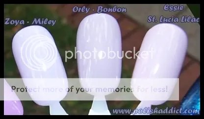
4 coats each for these: Zoya Miley (4 coats required for bottle color with a Zoya? No…… you don’t say? – This one is from the Blissful Collection), Orly Bon Bon (Sugar Coated Collection), Essie St. Lucia Lilac (Permanent Collection).
Purple Haze is the fan favorite. I can’t say I was really impressed with the color on myself. The application and wear-time were flawless as always but I just didn’t LOVE it. I’m going to give it one more go, and perhaps let it go if I still don’t love it.
April 23, 2008
*Exact* Dupes: Zoya Yummy and OPI Just Groovy

My biggest nail polish pet peeve is accidentally buying a color that is similar to another color I already have. I can’t even say that these colors are similar. They are EXACT DUPLICATES of each other.
My initial reaction was frustration. I was warned by the ladies at MUA that these were close to each other but I didn’t listen. I just didn’t think they would be this close. For several reasons, my next thought was to swap the Zoya and keep the OPI. One reason being that I passionately hate Zoya. My hatred began the day I hauled from Zoya. I bought 8 or so colors. Of those, Zoya Suvi and Kotori from the Downtown Collection, I hated so much I had to swap them. Both colors took 4 coats and they looked cheap with my skin tone. The other color was Zoya Stephanie, as my namesake, I felt I had to buy it. I love the color. It’s a very light pink, almost white but it too took four coats to be even and opaque. It was an ungodly streak-fest to apply. After that disappointment I put myself on a Zoya no-buy and constantly preach the anti-Zoya gospel to anyone who will listen. The running joke on MUA is that Zoya killed my family and I became Catwoman. (Polish fumes kill brain cells. : D)
OPI, on the other hand, is my love. I mean really, OPI is my bread and butter. I spend my nights and days dreaming little OPI dreams – jonesing for the next collection, scouring the depths of the internet nail polish underworld and hole-in-the-wall beauty shops for coveted discontinueds. (Just Groovy was recently discontinued, more reason to keep it.) At least that’s how I felt until recently. Lately, OPI has been dropping the ball. Since OPI changed their formula to big 3 free, quality has been all over the place. The India collection is bleh, same colors – different names, nothing new or exciting.
But still my loyalty is with OPI so I thought for sure I would be keeping Just Groovy, no contest…

then I did the swatches. Wow, was I surprised. These swatches are without basecoat and topcoat. Both polishes were streaky, Zoya slightly less so. Both needed 3 coats to even out. OPI was really chalky, really tough to apply. I also prefer Zoya’s brush to OPI’s pro-wide. The finish on Yummy was a little more glossy than Just Groovy. Both polishes separate easily in the bottle. There is a very very slight difference in color – but it’s not in any way noticeable even to the MUA nail-board eye.
What now?… I’ve heard horror stories about Zoya’s wear, like chips within hours of application (I don’t know first hand because I always end up removing Zoyas almost immediately) but I had a really tough time with Just Groovy’s application.
So I decided to wear Yummy on my left hand and Just Groovy on my right hand to see what’s what. For the actual mani, I used Barielle Camo as the base which completely fixed Yummy’s streakiness but seemed to actually make Just Groovy *more* streaky. Seche Vite fixed the unevenness that I got with both colors after applying 3 coats. I’ll post in a few days with the results.


