August 4, 2008
Lippmann Collection Fall 2008 Swatches
Sorry about that hiatus, I started a new soul-destroying job and I’ve had zero free time and zero sunlight with which to take swatch images. I’m going to invest in a light box so that I don’t have to be so sun dependent, until then, you guys will have to make due with sub-par indoor lighting.
Ok no more excuses for the moment, let’s get back to the Fall Blitzkrieg. That’s what I’ve decided to dub the insanity that is about to ensue when all the fall colors hit the shelves. It’s really like all the nail polish companies got together and conspired to empty out some bank accounts.
Here’s Lippmann Collection’s 4 new shades for fall:

Lippmann Collection Rhapsody in White is a frosty white with a tinge of silver. This is two coats in sunlight, (the only sunlight picture I was able to get today.) It’s a great color but I got a lot of noticeable brush strokes. I am not a fan of brush strokes.

Lippmann Stop and Stare is a magenta based bright jelly creme red. Gorgeous. This is 3 coats, but it’s wearable at 2 coats if you don’t mind VPL. This one had great application, not a streak in sight, smooth and perfect. I’m tempted to say that Lippmann Stop and Stare is dupish to Essie Jelly Apple, but I’m hesitant because JA is more a true red, and SaS has a magenta tone to it. I’ll do comparison swatches soon.

To be honest, I was a little surprised to see a true black in Lippmann’s fall collection. Not to hate on Lippmann, but black is black is… black. However, black is supposed to be making a come back this fall so I guess it makes sense. This is a normal, glossy, unadulterated true black creme. The application was excellent, it’s opaque in coat, but I preferred it with two. Now that I think about it, I wonder if every black really is created equal. I’ve never actually done side by side comparisons of my black cremes. My HG go-to black for layering is Milani Black Magic. It’s cheap and gets the job done so I’ve never really questioned the difference between tones, application, and wear in blacks. *light bulb goes on for article*

Lippmann Collection Pump Up the Jam is definitely the stand out color from the new Lippmann fall shades. I’m really loving these shimmery vampies. Judging by the enthusiasm for them on the nail board, I expect that vampy shimmers are going to be big this Fall. Lippmann describes this color as “Boysenberry Bijoux”. Not really sure what that means, but man, I love this color. It’s aubergine shimmer with a blackish base. This image does not do this polish justice, this one is a definite ‘must have’. I’ll definitely revisit this color for you guys when the sun comes back out, darn Florida weather.
Special thanks to Lippmann.
July 23, 2008
Bling Incognito: Misa Sugar Sugar Collection Swatches
Misa contacted me after I posted a negative review of Misa Indescribable. They said that they would do their best to rework the formula to create better, less streaky application. I was really impressed that they reached out to me as a dissatisfied customer. Indescribable was the first Misa polish I tried, since then I’ve had much better results with their polish but it’s still pretty great that they were concerned. Kudos to Misa for the excellent customer service.
Sorry guys this post isn’t for the new collection. I know, how horrible of a tease am I? I’ll have swatches of Poisoned Passion up this weekend, until then, get your fix by checking out Scrangie’s and Masa’s swatches and comparisons.
Sugar Sugar is Misa’s previous Spring/Summer collection. It is composed of 3 base colors and 3 ‘toppings’. It’s my personal opinion that these polishes were meant to be worn mixed and matched, layered over each other. The name Sugar Sugar is very fitting, all the colors in this collection look powdery and sheer on the nail. But you’ll find, like I did, that this seemingly princess-y collection has a darker, cooler side. All these polishes applied exceptionally well, no application issues at all.
First, the base colors:

Misa Sugar Daddy is my favorite from this collection. Gorgeous. I’ve been loving whites lately and this one has very fine silvery microshimmer that sets it apart from the other whites in my stash. It’s opaque but still somewhat translucent at 3 coats. I feel that Misa Confection Section was meant to be the topping for Sugar Daddy.

Misa Lolli Jolly is a soft sheer pink with microshimmer. Lolli Jolly is dupish to OPI Princesses Rule and Sinful Glass Pink. It’s still very sheer even at 3 coats. Misa Candy Girl compliments Lolli Jolly.

Misa Honeybunch is the silvery white version of Lolli Jolly. This swatch is also 3 coats. In the image Honeybunch seems to fade from very opaque on my index finger to very sheer on my pinkie finger. That is the result of shading. Interestingly, Honeybunch looks more sheer in the shade and more opaque in full on sunlight. Finally, I think the teal in Misa Sweet Pleasure compliments the silver in Honeybunch.

Here are the three base colors side-by-side. They may look similar but each one has it’s own charm. I actually did try to capture images of all these polishes layered over each other. I just couldn’t get the subtle shimmer to show up accurately with my camera. Suffice it to say that the combinations are really pretty, especially using Candy Girl and Sweet Pleasures together over Lolli Jolly as a base.
Now for the ‘toppings’:

Misa Confection Section is a chunky multi-toned glitter polish. You can use this one over any polish in this collection (well really over any polish, period) but I think it’s especially suited to be layered over Sugar Daddy.

Misa Candy Girl is a pink jelly base with suspended blurple microshimmer. Ultra sheer, it’s gorgeous layered over Lolli Jolly. It’s my second favorite from this collection, you’ll see why below.

Misa Sweet Pleasure is teal toned microshimmer suspended in nude jelly polish. This is 3 coats in the sunlight. Even in the full on midday Sun this polish is very subtle and tame. It’s beautiful, I don’t say that very often about sheers.
Now for the really exciting stuff – the ‘toppings’ over black:

Sugar Sugar is rocking the major undercover bling.

Candy Girl is blue to purple duochrome! DUOCHROME! *dies* Confection Section becomes green toned over black, very ‘the truth is out there-ish’ so I think this will be my mani for the X-Files opening this weekend. Sweet Pleasures over black looks a bit like Zoya Kotori but more blinged out.
Special thanks to Misa.
July 2, 2008
America, %*@& Yeah!
This is my attempt at a patriotic mani for the 4th of July. I used the following: OPI The Thrill of Brazil (and believe me, the irony is not lost on me), Rescue Beauty Lounge Dead Calm, Art Club by Color Club White and Silver Glitter, both of which are available individually or in the Art Club Bridal Kit.

I was torn over whether to use Silver Glitter or the tiny little silver crystals that come in the Bridal Kit. I ultimately decided to just wing it with the glitter. I’m a major newb at nail art so I have to say – for a first attempt, I’m really pleased with the results.

First let me say, I am so sorry about the sub-par application and lighting, again. I’ll be back to my usual application and lighting soon, I promise I’ll get it together. Second, OPI The Thrill of Brazil is one of my favorite reds, EVER. It applies like butter. Opaque in one coat, perfect in two – this red shines like there is no tomorrow. Simply, gorgeous. For the blue, I used Rescue Beauty Lounge Dead Calm. It was great for this mani because it, too, is opaque in one coat. I was able to use just one brush stroke for the blue behind the stars. Click here for a swatch of Rescue Beauty Lounge Dead Calm.
Finally, Art Club by Color Club – amazing. I’ve had the Bridal Kit and the Carnaval Kit for a while now but I’ve been stuck in professional-mani purgatory since the beginning of the summer so I haven’t been able to try them out until today. And WOW, I love these nail art polishes. The super long ultra fine brush is incredibly easy to use. The kits in general are pretty great. They come with 4 or so nail art polishes in assorted colors or glitters, decals, beads, stones, and other cute little accents.
To celebrate my nail freedom in exactly one month, I’m planning on breaking out all my accumulated nail art products. Seriously, I’ve been stock piling nail art supplies for a few months now in anticipation of a ridiculously elaborate nail art week on The Polish Addict, so if you’re secretly into the kitsch, like me, stay tuned.
June 4, 2008
Misa – Indescribable: Indescribably Disappointing
 Misa – Indescribable is a dainty off white that leans towards pink, very chic. This color looks *beautiful* in the bottle. I can’t say the same for the end result on the nail. Misa Indescribable was fairly streaky so I had to resort to using Barielle Camo as a base. That helped a bit but not enough. It took about 4 coats to even out correctly. The color was really pretty for about a day, then the color started to darken – as if the polish was actually picking up dirt or something. I started off with an attractive (although difficult to apply) pinkish off white and ended up with a greyish yellowish off white. I had high hopes but this polish did not meet my expectations, very disappointing. (I apologize it seems like a lot of my opinions lately have been really negative.) To be fair, other people seem to really like Misa Indescribable so I don’t want to flat out say that I don’t recommend it. It’s entirely possible that someone else will have better luck with it than I did. If you own it, what do you think?
May 28, 2008
Variations on a Theme: The Traditional Essie French Manicure
I know I’m in the minority when it comes to love for french manicures. I even like french for… *gasp*… pedicures, blasphemy, I know. In hopes of convincing more people to come to the dark side (rather the light pink and white side), I decided to do a series on the various types of french manicures. We’ll be looking at different polishes that can comprise the set as well as different application styles and looks. Today, we’re looking at, what is in my opinion, the quintessential french manicure: The Traditional Essie French Mani.
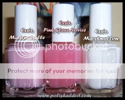
When it comes to demure, but sophisticated, nudes, pinks, and neutrals – Essie is the go-to brand. To me, Essie is also synonymous with french manis. I’ve tried several french mani combinations, nothing compares to the look you get with Essie Mademoiselle and Essie Marshmallow. Most people would refer to this combo as being an American French Manicure. (For an explanation for the differences between french mani styles check out this link.) The combo is soft and natural looking, definitely among my personal favorites but also widely popular with just about everyone who like french manis. Essie Pink Glove Service can also be used as a base color for a french mani but here I used it as the over-layer. Generally, I like flashy stark white tips but since I’m temporarily stuck in realm of professional looking manis, I decided to layer Pink Glove Service to dim Marshmallow a bit. I like the way it looks but ultimately I could have done without the extra PGS coat because Mademoiselle and Marshmallow look very professional all on their own.

As far as application: This is base coat plus one coat of Mademoiselle, perfectly smooth and even. Mademoiselle looks very pink in the bottle but applies translucent. I needed two coats of Marshmallow for the tips to look solid. I did this free hand so, as you can imagine, it was a huge pain in the butt. Stickers are great but they work best for the very patient. I find it easier to just do it free hand. Doing free hand correctly takes some practice but that’s better than fumbling with the stickers. The nail board wisdom tip for getting a good solid white tip is too move your finger instead of the brush, that’s also what works best for me.
May 26, 2008
Orly Love Collection Swatches
First a personal update: I want to apologize to my loyal readers, I haven’t been updating often. I moved in with my family for the summer to do an internship. The way our internet was set up, I had to write all my articles in my 14 year-old little brother’s room. My brother spends all his time playing massive multi-player online games, which means all my articles had to be written to the tune of my brother screaming at his teammates on his headset. I couldn’t take it anymore, so I bought my family a wireless router. Now I can write in peace, expect more updates and please stick with me. ; )
And now for my thoughts on Orly Love Collection: NOT IMPRESSED. Generally, the colors have ok application, not streaky but almost none of the colors were flattering. Most of the colors are translucent at 2 coats, so if you’re like me and don’t like translucent colors, you’d need to use 4+ coats to get bottle color – but 4 coats = bubble hell.

On my eternal search for wearable off-whites, I had high hopes for Orly My Beau. It’s a white eggshell type color. It’s not unattractive per se but the yellow tones in it looked weird with my skin tone. This swatch is 4 coats, you can’t see the bubbles in the picture but I assure you that they are there.

At two coats, Orly Dream Boat would probably be a good french mani color. This swatch is 4 coats, same issues with bubbles. And again, it’s just not flattering for my skin tone.

Someone on MUA compared Orly Secret Admirer to a creamsicle, that’s the perfect description for this color. This swatch is 4 coats. Again, this collection just really wasn’t meant for people with my skin color.

Orly First Kiss was one of the fan favorites from this collection. It’s the only color from the Love Collection that I’ve worn as a mani. Again, the color, that I describe as a ‘dead’ pink for it’s lack of luster, did nothing for my skin tone. I wore it for 3 days and it still did grow on me. I have seen people with lighter skin tones wear it very well but there are better light pinks out there for us darker girls. Using only two coats, it would probably work better for french manis, but why bother when you can get Essie Mademoiselle instead.

I actually don’t have anything negative to say about Orly Crush on You. It’s a great orange with great application, this swatch is 2 thick coats.

Orly Butterflies and Orly Crush on You are the two stand out colors from this collection. Butterflies had great application, the swatch is 2 thick coats. This hot pink is very vivid – both Butterflies and Crush on You are great colors for summer and spring.
May 12, 2008
OPI Time-Less is More: The *Perfect* Off-white
 I have been endlessly searching for a perfect wearable off-white. Most are unacceptable to me because the colors are either too streaky, too white, or too off-white leaning towards pink. After a lot of searching and a lot of duds, I finally found the perfect off-white: OPI Time-Less is More from the Beyond Chic, 2008’s Soft Shades Collection. I was pretty excited about Beyond Chic before it came out, even though no one else seemed to be into the collection. In an effort to be less extravagant in my polish purchases, I successfully talked myself out of getting the whole collection. I own a lot of soft pinks and one of the lovely girls on MUA RAOK’d me a white with gold shimmer, thereby negating my need for the 2 white with gold shimmer polishes from Chic Shades. But, in a moment of weakness, I finally gave in for Time-less is More. I’m really glad I did. My only complaint is that it took 3 to 4 coats to achieve bottle color, but that’s to be expected with colors like this. I didn’t have much streakiness trouble with Barielle Camo as a base. Scrangie has pictures of the whole collection up on her blog (as usual), so check it out over there. Thanks to her, I now officially want the whole collection again – too bad I’m on a major-hardcore-for-real-no-breaking-this-time-no-buy.
In other news, I wrote a mini-dictionary for the site, the Lacquer Lexicon. If you ever find that you have no clue what I’m talking about shoot me an email or comment so I can clarify in the Lexicon. Additionally, I’m starting a serial segment where I answer nail polish related questions. If you guys ever need any advice about anything nail related let me know, If I don’t know the answer, I’ll find it out for you, also feel free to send me pictures of unidentified polishes or color comparison requests. I’m going to get to the questions and requests I’ve gotten recently very soon, scout’s honor! : )


