August 25, 2008
Fall Blitzkrieg: China Glaze Operation Colour
Please read the bold disclaimers under Agent Lavender & Secret Peri-wink-le.
China Glaze has really gone above and beyond this Fall – all three of their new collections are mostly composed of what I consider to be unique colors. Operation Colour is particularly special because these colors are not typically reminiscent of Fall. It’s like China Glaze is saying, hey, you don’t have to spend the entire fall in muted, dark colors – extend the summer just a bit (which to me, as a Floridian, makes perfect sense). Rumor has it that this collection will be available online in about a week or so.

I know I say this in just about every post and sadly I will have to continue to do so until I’m no longer an impoverished student that cannot afford a better camera: this color is not blue in real life, China Glaze Agent Lavender is very visibly a light lavender. The consistency of the polish reminded me of China Glaze Second-hand Silk – it’s a chalky 3 coater. My bottle was a bit on the thick side but I don’t think that is going to be representative of the polish as a rule. Every blog that has covered China Glaze this season has complained about application issues, always in reference to different colors. If you happen to unluckily chance upon a thick bottle of polish, from any brand, a few drops of generic nail polish thinner will do the trick – do not use nail polish remover for this purpose. (In real life Agent Lavender is much lighter than it appears in this photo, I’m really sorry guys I know how annoying this is – swatches are supposed to be accurate.)

China Glaze Code Orange is pumpkin with pinkish shimmer. The shimmer is very obvious outdoors although not as pink as it looks in the bottle. In doors, not surprisingly, it looks like a creme. The color is a slightly darker orange than it appears in the image above. There were no application issues with this color – I think it looks better with 3 coats but it’s definitely wearable at 2.

China Glaze Golden Opportunity is a shimmery mustard yellow. I had some major cuticle drag with this color, but it’s workable at 3 coats.

China Glaze Pink Underground is a Barbie pink laced with magenta toned shimmer. It, too, was chalky and a bit on the thick side. The base color is 2 or 3 shades darker than China Glaze Second-hand Silk.

China Glaze Revolution is an ultra glossy bright orangey-red. It had the best application of the bunch, easy, smooth, perfect in 2 coats. No matter how often I see them, I never ever *ever* get tired of these bright reds. Gorgeous.

And finally, China Glaze Secret Peri-wink-le. Geez. I’m almost ashamed to post this picture – unlike my depiction of this color, it is not blue at all, it actually is periwinkle. This is the standout color from the collection as far as I’m concerned. I absolutely love out of the ordinary colors with a creme finish. To me the absence of shimmer is synonymous with chic sophistication, no offense to shimmer lovers. For as long as I can remember unique colors are almost always also shimmery. It happens so often that I associate shimmer with commonness. Don’t get me wrong. I wear shimmers, most of the time begrudgingly. I mean, I don’t hate them per se. I just prefer cremes and it’s just great to see some variation in finish choice. (In real life Secret Peri-wink-le is lighter and not as bright blue as it appears in this photo, again I am SO sorry, this really is unacceptable but despite trying different settings, my camera always takes inaccurate images when it comes to blues and purples. The best I can do for now is try to accurately describe these for you.)
Special thanks to China Glaze.
August 19, 2008
Fall Blitzkrieg: China Glaze Rodeo Diva Swatches Part 2
Finally, here’s the remaining colors from the China Glaze Rodeo Diva Swatches, I apologize for the delay. You can see the first set here. The sun cooperated a whole lot of not at all in photographing of these swatches. The remaining colors in the Rodeo Diva Collection applied very well, 2 coats each, excellent consistency, except where noted.

China Glaze Red Stallion is a shimmery mid-tone red. It’s a pretty color but you guys know how I feel about shimmery reds.

China Glaze Prize Winning Mare is more my type of thing. I actually like it more in the shade than in the sunlight with full on shimmer. In the shade, it’s a more subtle gold speckled brown, very beautiful. Scrangie thinks it’s somewhat similar to Dior Gold Nugget.

China Glaze Golden Spurs is tan with gold shimmer. I noticed that when I applied it with 2 thin coats I got a lighter shade than when I used 2 thick coats which gave me a darker tan shade.

Oh man China Glaze Cowgirl Up was a pain in the butt to photograph. I apologize for the glare, the sun was setting and there were many clouds over head (Tropical Storm Fay hates nail polish apparently). I was only able to take a few snaps before the weather thwarted my efforts completely. Cowgirl Up, a violet with multi-toned blurple shimmer, is a much loved color from this collection, but again, probably not for me.

China Glaze Branding Iron is a brownish red with gorgeous red shimmer. Branding Iron is like a browner lighter version OPI Midnight in Moscow. I did have some difficulties with the application of Branding Iron – my bottle was really thick.

China Glaze Yee-Haw! is my least favorite color in this entire collection. It’s peach with gold shimmer. As soon as I saw this one I knew I would feel that way so I decided to use it for a manicure. Sometimes colors grow on me, that’s not the case here. There’s nothing wrong with Yee-Haw! per se, it’s actually a really pretty color – but colors like this just don’t suit me.
Special thanks to China Glaze.
August 11, 2008
Fall Blitzkrieg: China Glaze Rodeo Diva Swatches Part 1
The China Glaze Rodeo Diva collection is split up into two parts. Now, here I thought that that I was giving you guys one full box set only to find, after looking at the China Glaze website, that mine were packaged differently. So basically my swatches will be split up into two posts, the polish selection being arbitrary and willy nilly.
Everyone (Scrangie, Sminkan, Hill here and here, Misa Masa, Makeup My Lack, RocketQueen, and ALU – as you can see, I’m super late to this party) has been raving about this collection and the reason for that is obvious to me. These colors are great and for the most part, very unique. For me, they applied really well although Scrangie mentions that some colors gave her a bit of trouble. If you bothered to click all those links I just gave you, you’ll see that no one has similar looking swatches of this collection. That’s because the whole collection is incredibly chameleon-like. They look different, at different angles and in different forms of light. They aren’t duochrome, but the shimmer in them tends to give the colors different tones depending on the aforementioned variables. I don’t think anyone who buys this collection will be displeased but if you are a major stickler for color accuracy in swatches I really recommend looking at everyone’s swatches and searching nailgal.com before buying.
Now on to my swatches:
Gussied Up Green is probably my hands down favorite from this collection. I think it’s really great that China Glaze listened to the masses and finally released a good green. In the bottle, Gussied Up Green has an amazing multi-chromatic effect – it goes from green to blue to purple, but sadly, it doesn’t do that on the nail. Applied, it reminds me of the shimmery dark green used to paint carnival rides and roller coasters. The darkness of the green varies to some extent as well, being very dark in some lights and lighter in others.

China Glaze Side-Saddle is a little tough to describe. It’s a reddish, purplish, brown, with gold shimmer. In the shade it almost looks like a reddish brown creme.

China Glaze Rodeo Fanatic is definitely one of the fan favorites from this collection. It’s sort of a dark turquoise-y blue with light greenish blue shimmer. In the bottle is has a blue to purple duochrome that is not present when applied on the nail. Siobhan from MUA discovered that Rodeo Fanatic is a fairly close dupe to the coveted Mac Whirlwind – which is great for me since I missed out on Whirlwind when it first came out.

China Glaze Midnight Ride is another of my personal favorites from this collection. I’ve been on this dark purple shimmer kick lately so Midnight Ride is right up my alley. It’s different from Color Club Groove Thang which has a darker purple shimmer too it, but that difference in shimmer might not be too noticeable to the non-nail board eye.

I almost died when I saw China Glaze Wagon Trial, really. I don’t know what else to say other than, holy sh*t, I freaking love this color. It looks olive on the nail and in the bottle, but as Scrangie astutely pointed out, it’s probably actually black with gold shimmer. It’s very dark olive in some lights and bright shimmery light olive in others, you can sort of see the transition of color on my nails above.

China Glaze Lasso My Heart is another fan favorite but it’s not for me – not that I dislike it per se, I just don’t usually wear shimmers that are red, pink, or pinkish purple. Maybe some day these colors will grow on me… but that’s a huge maybe. Lasso My Heart is pinkish purple, perhaps violet, with gold shimmer. Don’t judge it based on my taste though, I’m definitely alone, everyone else loves it.
Special thanks to China Glaze.
June 15, 2008
China Glaze ImMaterial Gurl Collection Swatches
Wow. I haven’t been this impressed with a collection in AGES. I love all the colors. The application of most of the colors was amazing, like butter. This collection hasn’t gotten that much hype from the nail polish community (yes, there is such a thing) and I’m a little bit at a loss as to why because every color is worth owning, each one unique and beautiful.
I also really love that China Glaze made minis of this entire collection. Most companies make minis. It seems to me that Color Club and Essie choose the colors that are expected to be most popular and sell those in mini packs. OPI seems to pick 1 popular color and 2 useless colors and offer those in a mini pack with a completely useless mini Rapid Dry. China Glaze is the only company I can think of that is offering entire collections in mini form. I love this concept because I like to own entire collections but without mini packs, doing so is restrictively expensive. Well played China Glaze, well played.

China Glaze Atelier Tulle was my absolute favorite from this collection. The application was -*PERFECT*-, on par with Rescue Beauty Lounge’s formula. Recently I’ve been wearing a lot of really difficult to apply polish so I had forgotten what applying a really excellent polish is like – it’s fun instead of frustrating. I also really love *LOVE* the color, the image simply does not do it justice. It’s been a really long time since I’ve worn a color that made me just stare down at my nails constantly in awe. I also felt like it was work appropriate even though I would not consider it to be a traditionally professional looking color. Great, just great.

China Glaze Designer Satin is my second favorite from this collection. Such a deep dramatic dark fuchsia – same amazing application as Atelier Tulle.

China Glaze Heirloom Organza is really unique. It’s sort of a dimmed grayed-out brown. It took 3 coats and was moderately hard to apply, but the final product made it worth it.

China Glaze Mom’s Chiffon is probably the most accessible color in this collection. Excellent application.

China Glaze Second-Hand Silk actually caused a bit of a stir online. The promotional images made this color look like a grayed out lilac so a lot of people were really disappointed to find that it’s actually a barbie pink. I had a tough time with the application. It wasn’t streaky but the formula was too watery so I got a lot of cuticle drag. A third coat evened everything out.

Finally, China Glaze Vintage Crepe. This is a muted orange. Like the others, excellent application.
Special thanks to China Glaze.
June 1, 2008
Bright Orange Comparison Swatches

It’s so difficult to take good images of neon and bright shades. Color Club Orange Revenge is much brighter and much more neon in person. China Glaze Japanese Koi leans towards red. The only true orange here is Orly Orange Punch but there was something seriously wrong with my bottle. There were a ton of weird white flecks inside the bottle. I’ve never seen anything like it. I had to redo the nail over and over because the flecks kept showing up on the nail. I imagine doing a full mani would prove impossible. All these polishes had great application, minus the flecks, of course.
April 30, 2008
Neon Nail Polish is It This Summer
China Glaze did it first with the Ink Collection. Nubar has the Get Hot collection, Color Club has the Flower Power collection, even Essie ventured away from nudes and pinks to do a mini collection, Neon Shorts, this summer.

Neon is definitely not in everyone’s nail polish comfort zone. If you want to ease yourself into this trend, try wearing a neon orange or red similar to the one Rihanna is wearing in this picture. (look for Color Club – Sexsea or China Glaze – Japanese Koi)
Those of you who want to go all out neon, like Rihanna’s nails in picture below, try China Glaze – Celtic Sun.
If having neon nails is something you want to look into but you aren’t sure whether you’ll like it, don’t pour tons of money into it by purchasing expensive brands. Instead, take a trip to your local drug store. This trend has already been picked up by the less expensive brands. Sinful Colors, a mainstay at Walgreens and a very excellent inexpensive brand, has just released their neon collection. If you have a Claire’s Icing at your local mall, go pick up their recently released neon five pack.
I love neon. Were it not for my summer internship with the State Attorney’s Office, I would never take these colors off – but I know it’s not for everyone. What do you guys think about it, are you going to rock the neon this summer? If yes, what are your favorite colors?
April 29, 2008
Blue Comparison Swatches (OPI – Dating a Royal Mod Brights Collection)
It’s no surprise that OPI is late to the party yet again. Blues were the thing last season, but for those of us who don’t care about strictly following seasonal trends, OPI Dating a Royal from the new Mod Brights Collection is pretty amazing.

Originally, I was going to compare all of these colors but once I got the bottles together it was pretty clear that the only real contenders for comparison were Lippmann Collection – Rehab and Rescue Beauty Lounge – Dead Calm. China Glaze – Shower Together (twin of China Glaze – Aqua Baby), L.A. Girl Flare – Twinkling, and OPI Just Groovy don’t look anything like Dating a Royal, or each other for that matter. There was some concern arising on the nail board that all these colors might be too similar to justify owning all of them, but as you can see from the bottle picture, that’s not the case.

2 Coats Rescue Beauty Lounge – Dead Clam, 3 Coats OPI – Dating a Royal, and a whopping 4 coats for Lippmann Collection – Rehab
I apologize for the quality of this image. For some reason I just could not get these colors to photograph well. This was the clearest image of the bunch, but even with the lack of focus, this image is an accurate depiction of what these colors look like in person. The online teaser images of Dating a Royal made it seem like it would be more dupish to the aqua blues. As it turns out, it’s a much darker blue, but not as dark as the blues that were popular last season. Its comparative lightness makes it more relevant to the trends of this spring and summer but since it’s not technically a light blue it will be wearable in the fall. I’ll give everyone the skinny on the application and wear when I do the full swatches.
If there are any colors you guys want compared drop me an email or comment with your request. : )
In other news, I am now a member of Alltop.com. Yeay! Alltop condenses the best blogs on the net by category so you can read about your favorite topics all in one place. Their beauty section is pretty comprehensive, you guys should check them out if you haven’t already.
April 25, 2008
Purple and Lilac Comparison Swatches
Purple and lilac have been pretty popular this spring. I made these swatches originally to help the girls at MUA find a cheaper alternative to the ever prohibitively expensive but wildly popular Rescue Beauty Lounge – Purple Haze. We were all pretty sad to find that there really isn’t a cheaper alternative to that particular color. No other brand has a shade of purple that even comes close. That is not to say these other colors aren’t worth it, all these purples and lilacs are beautiful in their own right. The only one missing that I really feel should have been included for comparison is Essie – Looking for Love. In the bottle, it’s a really beautiful vivid lilac – but – I had to decide against purchasing it because of its notorious and irreparable streakiness.

3 Coats China Glaze – Spontaneous (The Flirt Collection), 2 coats Rescue Beauty Lounge – Purple Haze (The Spring ’08 Collection), 3 Coats OPI – Do You Lilac It? (The Original Brights Collection)
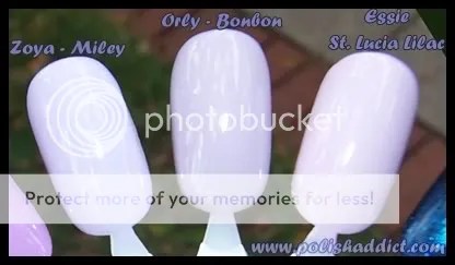
4 coats each for these: Zoya Miley (4 coats required for bottle color with a Zoya? No…… you don’t say? – This one is from the Blissful Collection), Orly Bon Bon (Sugar Coated Collection), Essie St. Lucia Lilac (Permanent Collection).
Purple Haze is the fan favorite. I can’t say I was really impressed with the color on myself. The application and wear-time were flawless as always but I just didn’t LOVE it. I’m going to give it one more go, and perhaps let it go if I still don’t love it.
April 22, 2008
Battle of the Bling: Silver Holographic Top Coats

Here are the Contenders.

My initial thought was the Orly is just a glitter top coat that is slightly more reflective than normal glitter. INM is pretty much the same as the Orly with smaller glitter and more density. INM (both the silver and gold versions) is the only brand of glitter top coat I own that completely settles at the bottom. The bottle has a sticker on it that says, “shake it up” which, of course, is blasphemous – one should never shake a bottle of nail polish. To get all the glitter to evenly disperse throughout the bottle using the correct method (i.e. rolling the bottle inbetween your fingers) is incredibly time consuming and irritating. Finally, the fan favorite, Wireless, from the OMG collection, is the densest of all with the finest glitter. Let’s Do it in 3-D, from the Kaleidoscope Collection, is not a topcoat, it’s only here for comparison because it looked so much like Wireless to me that I initially mistook one for the other when I was taking these pictures. Wireless is probably just a more diluted version of Let’s Do it in 3-D.
This is 2 coats OPI – Black Onyx and 1 Coat for each Top Coat.

-Now for the real bling-

Clearly, Let’s Do it in 3-D brings the most *bling*. However, it’s not actually a top coat – it can’t win this contest. China Glaze – Wireless Top Coat is my pick. Owning both Wireless and INM is justifiable. They aren’t duplicates and the effect is clearly different. INM is basically a really nice (although run of the mill) glitter top coat while Wireless is more unique, I’m hesitant to call it glitter top coat at all. There is nothing really wrong with Orly, but if you own INM – no point in picking up a version with bigger and sparser glitter (unless you’re looking for something like that.)


