August 29, 2008
Back by Popular Demand: Work Appropriate Polishes – Rescue Beauty Lounge Edition
I’m so happy that you guys actually enjoy these work appropriate posts. The work appropriate theme is going to comprise a huge portion of a my posts for a while since I mostly write about the colors I’m currently wearing. : )
In any case, close to 1/4 of my collection are ‘work appropriate’ colors. You’d be surprised at how much variation there are in the classic professional looking colors. Nudes, taupes, pinks, and soft shades don’t have to be boring. I’m going to start a series of articles showcasing 3 of my favorite work appropriate colors from all my favorite brands. First up, Rescue Beauty Lounge.
I’m sure that no one will be shocked that Scrangie was the source of my lemmings for the following 3 colors.

Rescue Beauty Lounge Om is a strangely calming color, making the name very appropriate. Even so, it’s probably the most ‘serious’ muted pink in my collection. This swatch is 3 coats of Om, 1 coat of Seche Vite.

Rescue Beauty Lounge Grunge is my stick-it-to-the-man color (Ohh hoo hoo I’m sitting in your meeting wearing a color called Grunge, ha!). It’s a serious business appropriate color but at the same time it’s very moody and edgy. This color came out a while ago but it fits perfectly into the current mushroomy grayed-out color trend. Grunge looks creme 99.9% of the time but it actually has a whitish shimmer throughout. The shimmer is not highly light refractive which is why no one will ever see it. The danger of Grunge (and all similar mushroomy grayed-out colors like it) is that it may be a tough color to pull of successfully. Mushroomies seem to not flatter very pale skin tones and are seemingly more suitable to skin tones like my own. This swatch is 3 coats, 1 coat of Seche Vite.

Finally, Rescue Beauty Lounge Opaque Nude. Scrangie’s swatch (linked above) is a more accurate depiction of Opaque Nude’s bottle color. My swatch is darker due to lighting and my skin tone which brings out the ‘nudeness’ of this color. In my opinion, Opaque Nude is border-line business appropriate, perfectly okay for a less conservative office. I say this only because it might be too obvious. I feel like business appropriate colors have to be subtle, pretty but not necessarily noticeable and for most people this color will be very noticeable.
August 25, 2008
Fall Blitzkrieg: China Glaze Operation Colour
Please read the bold disclaimers under Agent Lavender & Secret Peri-wink-le.
China Glaze has really gone above and beyond this Fall – all three of their new collections are mostly composed of what I consider to be unique colors. Operation Colour is particularly special because these colors are not typically reminiscent of Fall. It’s like China Glaze is saying, hey, you don’t have to spend the entire fall in muted, dark colors – extend the summer just a bit (which to me, as a Floridian, makes perfect sense). Rumor has it that this collection will be available online in about a week or so.

I know I say this in just about every post and sadly I will have to continue to do so until I’m no longer an impoverished student that cannot afford a better camera: this color is not blue in real life, China Glaze Agent Lavender is very visibly a light lavender. The consistency of the polish reminded me of China Glaze Second-hand Silk – it’s a chalky 3 coater. My bottle was a bit on the thick side but I don’t think that is going to be representative of the polish as a rule. Every blog that has covered China Glaze this season has complained about application issues, always in reference to different colors. If you happen to unluckily chance upon a thick bottle of polish, from any brand, a few drops of generic nail polish thinner will do the trick – do not use nail polish remover for this purpose. (In real life Agent Lavender is much lighter than it appears in this photo, I’m really sorry guys I know how annoying this is – swatches are supposed to be accurate.)

China Glaze Code Orange is pumpkin with pinkish shimmer. The shimmer is very obvious outdoors although not as pink as it looks in the bottle. In doors, not surprisingly, it looks like a creme. The color is a slightly darker orange than it appears in the image above. There were no application issues with this color – I think it looks better with 3 coats but it’s definitely wearable at 2.

China Glaze Golden Opportunity is a shimmery mustard yellow. I had some major cuticle drag with this color, but it’s workable at 3 coats.

China Glaze Pink Underground is a Barbie pink laced with magenta toned shimmer. It, too, was chalky and a bit on the thick side. The base color is 2 or 3 shades darker than China Glaze Second-hand Silk.

China Glaze Revolution is an ultra glossy bright orangey-red. It had the best application of the bunch, easy, smooth, perfect in 2 coats. No matter how often I see them, I never ever *ever* get tired of these bright reds. Gorgeous.

And finally, China Glaze Secret Peri-wink-le. Geez. I’m almost ashamed to post this picture – unlike my depiction of this color, it is not blue at all, it actually is periwinkle. This is the standout color from the collection as far as I’m concerned. I absolutely love out of the ordinary colors with a creme finish. To me the absence of shimmer is synonymous with chic sophistication, no offense to shimmer lovers. For as long as I can remember unique colors are almost always also shimmery. It happens so often that I associate shimmer with commonness. Don’t get me wrong. I wear shimmers, most of the time begrudgingly. I mean, I don’t hate them per se. I just prefer cremes and it’s just great to see some variation in finish choice. (In real life Secret Peri-wink-le is lighter and not as bright blue as it appears in this photo, again I am SO sorry, this really is unacceptable but despite trying different settings, my camera always takes inaccurate images when it comes to blues and purples. The best I can do for now is try to accurately describe these for you.)
Special thanks to China Glaze.
July 23, 2008
Bling Incognito: Misa Sugar Sugar Collection Swatches
Misa contacted me after I posted a negative review of Misa Indescribable. They said that they would do their best to rework the formula to create better, less streaky application. I was really impressed that they reached out to me as a dissatisfied customer. Indescribable was the first Misa polish I tried, since then I’ve had much better results with their polish but it’s still pretty great that they were concerned. Kudos to Misa for the excellent customer service.
Sorry guys this post isn’t for the new collection. I know, how horrible of a tease am I? I’ll have swatches of Poisoned Passion up this weekend, until then, get your fix by checking out Scrangie’s and Masa’s swatches and comparisons.
Sugar Sugar is Misa’s previous Spring/Summer collection. It is composed of 3 base colors and 3 ‘toppings’. It’s my personal opinion that these polishes were meant to be worn mixed and matched, layered over each other. The name Sugar Sugar is very fitting, all the colors in this collection look powdery and sheer on the nail. But you’ll find, like I did, that this seemingly princess-y collection has a darker, cooler side. All these polishes applied exceptionally well, no application issues at all.
First, the base colors:

Misa Sugar Daddy is my favorite from this collection. Gorgeous. I’ve been loving whites lately and this one has very fine silvery microshimmer that sets it apart from the other whites in my stash. It’s opaque but still somewhat translucent at 3 coats. I feel that Misa Confection Section was meant to be the topping for Sugar Daddy.

Misa Lolli Jolly is a soft sheer pink with microshimmer. Lolli Jolly is dupish to OPI Princesses Rule and Sinful Glass Pink. It’s still very sheer even at 3 coats. Misa Candy Girl compliments Lolli Jolly.

Misa Honeybunch is the silvery white version of Lolli Jolly. This swatch is also 3 coats. In the image Honeybunch seems to fade from very opaque on my index finger to very sheer on my pinkie finger. That is the result of shading. Interestingly, Honeybunch looks more sheer in the shade and more opaque in full on sunlight. Finally, I think the teal in Misa Sweet Pleasure compliments the silver in Honeybunch.

Here are the three base colors side-by-side. They may look similar but each one has it’s own charm. I actually did try to capture images of all these polishes layered over each other. I just couldn’t get the subtle shimmer to show up accurately with my camera. Suffice it to say that the combinations are really pretty, especially using Candy Girl and Sweet Pleasures together over Lolli Jolly as a base.
Now for the ‘toppings’:

Misa Confection Section is a chunky multi-toned glitter polish. You can use this one over any polish in this collection (well really over any polish, period) but I think it’s especially suited to be layered over Sugar Daddy.

Misa Candy Girl is a pink jelly base with suspended blurple microshimmer. Ultra sheer, it’s gorgeous layered over Lolli Jolly. It’s my second favorite from this collection, you’ll see why below.

Misa Sweet Pleasure is teal toned microshimmer suspended in nude jelly polish. This is 3 coats in the sunlight. Even in the full on midday Sun this polish is very subtle and tame. It’s beautiful, I don’t say that very often about sheers.
Now for the really exciting stuff – the ‘toppings’ over black:

Sugar Sugar is rocking the major undercover bling.

Candy Girl is blue to purple duochrome! DUOCHROME! *dies* Confection Section becomes green toned over black, very ‘the truth is out there-ish’ so I think this will be my mani for the X-Files opening this weekend. Sweet Pleasures over black looks a bit like Zoya Kotori but more blinged out.
Special thanks to Misa.
July 20, 2008
Essie Fall 2008 Collection Swatches
What is this collection named? I have no idea. It’s a very mysterious collection, but the colors are great. While other polish companies are doing grays, purples, dark colors, and metallics for fall, Essie stayed true to form and maintained their usual palette range. These colors are more classic than they are exciting but these are colors that should be standard staples in all stashes. Scrangie has reviewed these already and I agree with her insights. The reds are *hot* and I, too, love the jelly-like finish that these colors sport. I wouldn’t call them true jellies per se because the colors aren’t completely translucent, but the finishes definitely have a unique quality. I imagined that these colors would be ultra glossy, but strangely, they weren’t. I know some people like the finish to be somewhat matte but I like my nails to blind oncoming traffic, so I plan to top these with an ultra gloss top coat. Finally, these were all 2 coaters, excellent application. Well played, Essie. This collection should be out in August.

Essie – Big Spender is a sophisticated purple-y pink. It’s not a neon shade, but it reminds me a lot of the neon colors that were so popular this summer. For that reason, I think it would be good transitional color to wear from the switch between Summer to Fall. Even if you don’t have those sorts of seasonal concerns, it’s still a sexy color.

LOOOOOVE this red. Essie Forever Young, a tomato red, is gorgeous, plain and simple. I used top coat for this swatch because of the matte drying. I’ve noted where I’ve taken the images with top coat, notice the contrast?

In my swatches, Essie Lacy Not Racy looks deceptively similar to Essie Tomboy No More pictured below. Both are ridiculous sexy colors, but they’re very different. Lacy Not Racy is more of a true red, while Tomboy No More is a deeper more vampy red. This swatch was taken with top coat, if you look at the swatch of Tomboy No More in contrast to this swatch, the matte drying is really apparent.

I just can’t get enough of these reds. Essie Tomboy No More would be perfect to use for the half moon mani, well actually all three reds would be. Love it.

This color is just one huge mystery. Scrangie and I, apparently, have different colors both named No Boundaries. My bottle was a hot pink as you can see above, but hers was a vampy plum. I like my version of No Boundaries but I really like Scrangie’s, so boooooo. I’m a little confused as to what happened, I’ll let you guys know when I figure it out.

People haven’t been very excited over Essie Swept Off My Feet but it’s my absolute favorite from this collection. It’s a muted pink, Scrangie describes it as dusty – I completely agree. I love these muted dusty colors that been released as of late. There’s just something about them, to me they seem edgy but classic. I love it.
Special thanks to Essie.
July 12, 2008
Swatches of My Zoya Promo Picks
I was pretty excited when Zoya announced this promo. I really put a lot of thought into which colors I would choose. Primarily I wanted to choose colors that I personally liked but also had good application and weren’t very popular. I didn’t want to choose colors I know a lot of people already own since that would defeat the purpose of getting a free bottle of polish. So here they are:
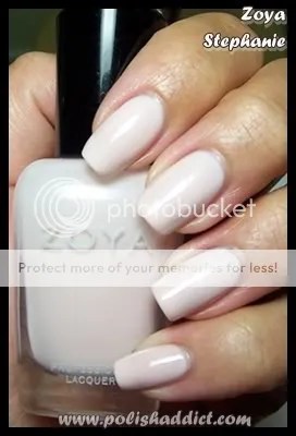
Zoya Stephanie. Ok, I do love this color, but let’s face it, I’m biased because it’s my namesake. It’s a very chic almost white light pink. The downside is that the application can be troublesome. It’s a 4 coater if you want opacity. I apply it using Barielle Camo as a base, that fixed the streakiness issues for me.
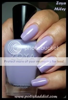
Zoya Miley. Those of you who follow my blog know that lilac is one of my white whales, so I just had to include it in my mini-collection. Miley is also a 4 coater but the application is perfect even without Camo. It reminds me of my beloved Orly Bon bon, although I think Bon bon leans a bit more towards periwinkle. This picture shows Miley as being more bluish than it is in real life – sorry guys, I tried to get the color depiction as accurate as I could but it’s almost impossible to photograph purples accurately without sunlight.

Zoya Rea is just ridiculously gorgeous. Rea is metallic with a foil like finish. Perfect in two coats, smooth application, no visible brush strokes. It was my favorite color from the Downtown collection by far. (Sorry, Kotori and Suvi fans.) The color is hard to describe, Zoya says it’s sparkling metallic plum – I’d say pinkish-purple. Whatever, bottomline, I love it.
I realize my colors are a bit conservative so if you’re looking for something more exciting, check out Casual Lavish for a list of all the blogs participating in this promotion. There really is a mini-collection for everyone.
June 25, 2008
Trying Out New Brands: Adorée
Most people that are into nail polish stick to the biggies: OPI, Essie, China Glaze, Color Club, Orly, Zoya, and the Drug Store brands. I know I’m particularly guilty of not venturing away from those very often. So I’m always excited to try out new brands. I’m pretty impressed with Adorée. First and most importantly, they aren’t expensive at 5 bucks a pop. The line is big 3 free but the polishes applied as if they had all the chemically goodness of which we are all so fond. I had good wear time with Seche Vite as a top coat and my typical work horse base coat. I’m also really impressed with the range and variation of color in their line. They actually have really unique polishes. We’re talking duo/multi-chromes, mutli-glitters here, people. I only have three polishes to show you guys but definitely check them out at Esther’s Nail Center (they’re also having a sale on Nubar).

Adorée Wild Inkberry is my favorite. It reminds me of a purple version of Essie Starry Starry Night. It’s a glitter polish but doesn’t dry with a rough finish, a plus. You can control the amount of bling by adding coats. This swatch is 4 coats. Normally that would drive me UP the wall but the polish looked good with 2 coats, 4 coats just made it a deeper purple and extra bling. Love it.
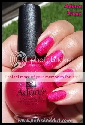
Adoree Peony is impossible to photograph. The color has strange texture, as though it were pearlescent but it’s not. It also has loose holographic glitter in it so it dries bumpy a la China Glaze Flying Dragon and Blue Sparrow. The bumpiness is easily fixed with a thick coat of Seche Vite. This color isn’t really me but I know a lot of you peeeenk lovers are going to go bonkers for this. It’s a great pedi color.

And finally a subtle one, Adoree Pink Pansy, a buildable sheer pink with a blue flash. I needed 4 coats to cover the whites of my nails, but like with Wild Inkberry, Pink Pansy applied very well and looked great at two coats. As a personal preference, I don’t like sheers, so buildable sheers are great for me. Since this color has a blue flash, at two coats, it’s perfect for a Funky French. I know I have a white with blue flash somewhere so I’m going to try it out.
June 16, 2008
Zoya Gossip Collection Swatches
I know Scrangie has already done swatches and comparisons of these but here’s my take on them.
The application was excellent on all of these. This collection didn’t have any 4 coaters (hallelujah). My sole complaint is a superficial one: I absolutely loathe that this collection was named after the ultra-wealthy rabble from yet another reality tv show that glorifies being worthless and vapid. (No offense to the people who like the show.) Regardless, the colors are very pretty and within the spectrum of this summer’s trend palette. Also, I must say that this collection is very well arranged; all these colors look like they belong together. I really appreciate when companies put thought into color arrangement – a collection is not a collection in the absence of a common theme or connection that relates the colors to one another.

Zoya Audrina is a pinkish purple borderline neon. This is 2 coats, it applied really well. This swatch was taken with a coat of Zoya Armor since the color is little bit neon, it dried matte.

Zoya Elodie is a bright salmon color. This swatch is two coats plus one coat of Zoya Armor. This is the only one I wore as a mani – it’s actually a funny story. It looks demure and inoffensive in the bottle so I thought to myself… I could probably get away with this one at work. Wrong. It’s much brighter on the nail than it is in the bottle. I liked it – but totally not work appropriate with my nails as long as they are right now. I totally could have gotten away with it if my nails were shorter.

Zoya Heidi is a creamy redish orange. The picture makes it look like a coral but it’s actually much more orange in person. I think it would be an excellent color for people who want to try orange, but are extravagant color shy.

For me, Zoya LC was the stand-out color from this collection. This swatch is two coats. LC is a very bright fuchsia red. The application of this color was actually the best of all the colors in the collection – very smooth and creamy.

Zoya Lo is a standard bright mid range pink, colors like this are always popular but this season they’ve been all over. Since I know this might come up in discussion, let me preemptively say that no this color is not similar to China Glaze Mom’s Chiffon. To me, it looks brighter than OPI Strawberry Margarita, OPI That’s Hot Pink, and OPI In-dia Mood for Love. Although it is my personal opinion that it’s not worth owning all of those (I know that the entire nail board will probably disagree with that statement). For example, I own OPI Koala Bear-y and OPI That’s Berry Daring so with the addition of Zoya Lo, I pretty much have that color range covered, no need for the others. This swatch is 3 coats.

And finally, Zoya Whitney. This is 2 coats. This color, like the previous one, has also been very popular this season.
Man I wish I could get away with wearing this kind of stuff. : ( I’m totally missing out on all these awesome summer colors. *kicks dirt* *grumbles* *stupid professional environment, stupid* */grumbles*
Special thanks to Zoya.
June 15, 2008
China Glaze ImMaterial Gurl Collection Swatches
Wow. I haven’t been this impressed with a collection in AGES. I love all the colors. The application of most of the colors was amazing, like butter. This collection hasn’t gotten that much hype from the nail polish community (yes, there is such a thing) and I’m a little bit at a loss as to why because every color is worth owning, each one unique and beautiful.
I also really love that China Glaze made minis of this entire collection. Most companies make minis. It seems to me that Color Club and Essie choose the colors that are expected to be most popular and sell those in mini packs. OPI seems to pick 1 popular color and 2 useless colors and offer those in a mini pack with a completely useless mini Rapid Dry. China Glaze is the only company I can think of that is offering entire collections in mini form. I love this concept because I like to own entire collections but without mini packs, doing so is restrictively expensive. Well played China Glaze, well played.

China Glaze Atelier Tulle was my absolute favorite from this collection. The application was -*PERFECT*-, on par with Rescue Beauty Lounge’s formula. Recently I’ve been wearing a lot of really difficult to apply polish so I had forgotten what applying a really excellent polish is like – it’s fun instead of frustrating. I also really love *LOVE* the color, the image simply does not do it justice. It’s been a really long time since I’ve worn a color that made me just stare down at my nails constantly in awe. I also felt like it was work appropriate even though I would not consider it to be a traditionally professional looking color. Great, just great.

China Glaze Designer Satin is my second favorite from this collection. Such a deep dramatic dark fuchsia – same amazing application as Atelier Tulle.

China Glaze Heirloom Organza is really unique. It’s sort of a dimmed grayed-out brown. It took 3 coats and was moderately hard to apply, but the final product made it worth it.

China Glaze Mom’s Chiffon is probably the most accessible color in this collection. Excellent application.

China Glaze Second-Hand Silk actually caused a bit of a stir online. The promotional images made this color look like a grayed out lilac so a lot of people were really disappointed to find that it’s actually a barbie pink. I had a tough time with the application. It wasn’t streaky but the formula was too watery so I got a lot of cuticle drag. A third coat evened everything out.

Finally, China Glaze Vintage Crepe. This is a muted orange. Like the others, excellent application.
Special thanks to China Glaze.
May 28, 2008
Variations on a Theme: The Traditional Essie French Manicure
I know I’m in the minority when it comes to love for french manicures. I even like french for… *gasp*… pedicures, blasphemy, I know. In hopes of convincing more people to come to the dark side (rather the light pink and white side), I decided to do a series on the various types of french manicures. We’ll be looking at different polishes that can comprise the set as well as different application styles and looks. Today, we’re looking at, what is in my opinion, the quintessential french manicure: The Traditional Essie French Mani.
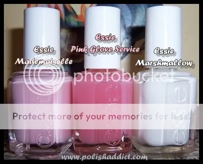
When it comes to demure, but sophisticated, nudes, pinks, and neutrals – Essie is the go-to brand. To me, Essie is also synonymous with french manis. I’ve tried several french mani combinations, nothing compares to the look you get with Essie Mademoiselle and Essie Marshmallow. Most people would refer to this combo as being an American French Manicure. (For an explanation for the differences between french mani styles check out this link.) The combo is soft and natural looking, definitely among my personal favorites but also widely popular with just about everyone who like french manis. Essie Pink Glove Service can also be used as a base color for a french mani but here I used it as the over-layer. Generally, I like flashy stark white tips but since I’m temporarily stuck in realm of professional looking manis, I decided to layer Pink Glove Service to dim Marshmallow a bit. I like the way it looks but ultimately I could have done without the extra PGS coat because Mademoiselle and Marshmallow look very professional all on their own.

As far as application: This is base coat plus one coat of Mademoiselle, perfectly smooth and even. Mademoiselle looks very pink in the bottle but applies translucent. I needed two coats of Marshmallow for the tips to look solid. I did this free hand so, as you can imagine, it was a huge pain in the butt. Stickers are great but they work best for the very patient. I find it easier to just do it free hand. Doing free hand correctly takes some practice but that’s better than fumbling with the stickers. The nail board wisdom tip for getting a good solid white tip is too move your finger instead of the brush, that’s also what works best for me.
May 26, 2008
Orly Love Collection Swatches
First a personal update: I want to apologize to my loyal readers, I haven’t been updating often. I moved in with my family for the summer to do an internship. The way our internet was set up, I had to write all my articles in my 14 year-old little brother’s room. My brother spends all his time playing massive multi-player online games, which means all my articles had to be written to the tune of my brother screaming at his teammates on his headset. I couldn’t take it anymore, so I bought my family a wireless router. Now I can write in peace, expect more updates and please stick with me. ; )
And now for my thoughts on Orly Love Collection: NOT IMPRESSED. Generally, the colors have ok application, not streaky but almost none of the colors were flattering. Most of the colors are translucent at 2 coats, so if you’re like me and don’t like translucent colors, you’d need to use 4+ coats to get bottle color – but 4 coats = bubble hell.

On my eternal search for wearable off-whites, I had high hopes for Orly My Beau. It’s a white eggshell type color. It’s not unattractive per se but the yellow tones in it looked weird with my skin tone. This swatch is 4 coats, you can’t see the bubbles in the picture but I assure you that they are there.

At two coats, Orly Dream Boat would probably be a good french mani color. This swatch is 4 coats, same issues with bubbles. And again, it’s just not flattering for my skin tone.

Someone on MUA compared Orly Secret Admirer to a creamsicle, that’s the perfect description for this color. This swatch is 4 coats. Again, this collection just really wasn’t meant for people with my skin color.

Orly First Kiss was one of the fan favorites from this collection. It’s the only color from the Love Collection that I’ve worn as a mani. Again, the color, that I describe as a ‘dead’ pink for it’s lack of luster, did nothing for my skin tone. I wore it for 3 days and it still did grow on me. I have seen people with lighter skin tones wear it very well but there are better light pinks out there for us darker girls. Using only two coats, it would probably work better for french manis, but why bother when you can get Essie Mademoiselle instead.

I actually don’t have anything negative to say about Orly Crush on You. It’s a great orange with great application, this swatch is 2 thick coats.

Orly Butterflies and Orly Crush on You are the two stand out colors from this collection. Butterflies had great application, the swatch is 2 thick coats. This hot pink is very vivid – both Butterflies and Crush on You are great colors for summer and spring.


