September 2, 2008
Fall Blitzkrieg: OPI La Collection De France
I’m a little late to the party (check out Scrangie’s swatches) but, of course, I have to give you guys my take on one of the biggest collections to hit us this Fall. I wasn’t all that excited for OPI France when I initially saw the promotional images. OPI has a proclivity for releasing several reds and ‘almost blacks’ in just about every collection and, frankly, it gets old. The promos of France made it seem like more of the same. Consequently, I wasn’t expecting to like these. I was pleasantly surprised to find that this collection is actually pretty cool.
Sure, a few of the colors were fairly run of the mill OPI type stuff. I’m not doing back flips for OPI Louvre me Louvre Me Not (ducks to avoid thrown stones, tomatoes, assorted rotting vegetables), but there are several solid gorgeous, unique colors in this collection. There have been a few complaints about colors in the France collection being thick and difficult to apply but I didn’t have any real trouble with them.
As a side note, I really feel like OPI did a good job of designing colors that are representative of French culture and fashion. I say that because I felt like they could have done more with the Indian collection, it’s good to see that they were spot on with France.
 *Dies* OPI You Don’t Know Jacques is my absolute favorite color from this collection. Seriously, every once a while an amazing color like this comes out and renews my passion for nail polish. The color is tough to describe, grayish, brownish, dirty, mushroomy? This is my current NOTD, 2 coats, love it. I’ve said it a million times and I’ll say it again, love these grayed out mushroomy colors. I just can’t get enough.

OPI Yes… I Can-Can! is a shimmery eggplant type color. The base color seems similar to OPI Lincoln Park After Dark. The shimmer seems multi-colored, I see flashes of green, silver, and violet in the bottle. On the nail, it’s silvery and serves to give Yes… I Can-Can! depth. This swatch is 3 coats but with careful application good coverage is possible at 2 coats.

OPI Tickle My France-y is my second favorite color from this collection. It’s a grayed out subtle nude pink – it is chic and sophisticated perfection. Earlier last week, when I went back into the professional nail color purgatory, Tickle My France-y was the first color I chose for the big switch. This color was so beautiful, so flattering that I didn’t even care about being forced to wear professional colors. This mani was 3 coats.

OPI Parlez-vous OPI?, another stand out color, is a grayed-out (or smokey as OPI puts it) plum. The application was slightly troublesome, my bottle was chalky and thick but it’s workable. This is 2 coats.

OPI Louvre Me Lourve Me Not is my least favorite color from this collection. Sorry guys, I know I’m completely alone, everyone else loves this one. There’s nothing inherently wrong with this color but I have a predisposition to disliking shimmers and I’ve just had my fill of shimmery mid-range purples this fall. You can’t really see it in my image but Louvre Me Lourve Me Not has blurple and violet shimmer. This swatch is 3 coats.

OPI I’m Fondue of You is a reddish light chocolaty brown with reddish brown shimmer. I don’t love this one. It’s pretty but not special. This swatch is 2 coats, I think the color would look better with 3.

OPI Eiffel for this Color is an ‘almost black’. OPI says it’s wine but it looks dark purple with violet shimmer to me. It’s similar to Yes… I Can-Can! but they’re different enough to warrant owning both if one is so inclined to do so. Normally, I would say boo to an almost black but I, surprisingly, like this color. This swatch is 2 coats.

Scrangie called OPI Crepes Suzi-ette a ‘mom’ color… it is – but – it’s hot. I think this one ventures into the realm of work appropriate. I’m actually surprised that I like this color too. I probably wouldn’t have batted an eye at this creamy reddish caramel in a store, but it’s actually very flattering on the nail. I would even dare say that it’s unique. This swatch is 2 coats.

There will always be reds in an OPI collection, shockingly there were only two in the France Collection. One of which, OPI Bastille My Heart, is a deep burgandy with violet shimmer throughout. Pretty, but standard.

OPI Baguette Me Not, a creamy salmon, is another shocker. Totally didn’t expect to like this ‘mom’ (haha) color but I love it. Very chic, very work appropriate. This swatch is 2 coats.

OPI A Oui Bit of Red, the other red in the France Collection, is a mid-range bright red. I love reds and I would have loved this one too, but for the shimmer. The saving grace is that the fuschia shimmer is very subtle, hardly noticeable. This swatch is 2 coats.

Finally, OPI We’ll Always Have Paris. Love. It. This is the color that I wanted the annoyingly almost black OPI Lincoln Park After Dark to be. I love LPAD but I always wanted it to be more noticeably purple and vampy. OPI granted my wish with We’ll Always Have Paris. Strangely, OPI says this color is dark coffee… definitely looks dark reddish purple to me.
Special thanks to OPI.
August 25, 2008
Fall Blitzkrieg: China Glaze Operation Colour
Please read the bold disclaimers under Agent Lavender & Secret Peri-wink-le.
China Glaze has really gone above and beyond this Fall – all three of their new collections are mostly composed of what I consider to be unique colors. Operation Colour is particularly special because these colors are not typically reminiscent of Fall. It’s like China Glaze is saying, hey, you don’t have to spend the entire fall in muted, dark colors – extend the summer just a bit (which to me, as a Floridian, makes perfect sense). Rumor has it that this collection will be available online in about a week or so.

I know I say this in just about every post and sadly I will have to continue to do so until I’m no longer an impoverished student that cannot afford a better camera: this color is not blue in real life, China Glaze Agent Lavender is very visibly a light lavender. The consistency of the polish reminded me of China Glaze Second-hand Silk – it’s a chalky 3 coater. My bottle was a bit on the thick side but I don’t think that is going to be representative of the polish as a rule. Every blog that has covered China Glaze this season has complained about application issues, always in reference to different colors. If you happen to unluckily chance upon a thick bottle of polish, from any brand, a few drops of generic nail polish thinner will do the trick – do not use nail polish remover for this purpose. (In real life Agent Lavender is much lighter than it appears in this photo, I’m really sorry guys I know how annoying this is – swatches are supposed to be accurate.)

China Glaze Code Orange is pumpkin with pinkish shimmer. The shimmer is very obvious outdoors although not as pink as it looks in the bottle. In doors, not surprisingly, it looks like a creme. The color is a slightly darker orange than it appears in the image above. There were no application issues with this color – I think it looks better with 3 coats but it’s definitely wearable at 2.

China Glaze Golden Opportunity is a shimmery mustard yellow. I had some major cuticle drag with this color, but it’s workable at 3 coats.

China Glaze Pink Underground is a Barbie pink laced with magenta toned shimmer. It, too, was chalky and a bit on the thick side. The base color is 2 or 3 shades darker than China Glaze Second-hand Silk.

China Glaze Revolution is an ultra glossy bright orangey-red. It had the best application of the bunch, easy, smooth, perfect in 2 coats. No matter how often I see them, I never ever *ever* get tired of these bright reds. Gorgeous.

And finally, China Glaze Secret Peri-wink-le. Geez. I’m almost ashamed to post this picture – unlike my depiction of this color, it is not blue at all, it actually is periwinkle. This is the standout color from the collection as far as I’m concerned. I absolutely love out of the ordinary colors with a creme finish. To me the absence of shimmer is synonymous with chic sophistication, no offense to shimmer lovers. For as long as I can remember unique colors are almost always also shimmery. It happens so often that I associate shimmer with commonness. Don’t get me wrong. I wear shimmers, most of the time begrudgingly. I mean, I don’t hate them per se. I just prefer cremes and it’s just great to see some variation in finish choice. (In real life Secret Peri-wink-le is lighter and not as bright blue as it appears in this photo, again I am SO sorry, this really is unacceptable but despite trying different settings, my camera always takes inaccurate images when it comes to blues and purples. The best I can do for now is try to accurately describe these for you.)
Special thanks to China Glaze.
August 19, 2008
Fall Blitzkrieg: China Glaze Rodeo Diva Swatches Part 2
Finally, here’s the remaining colors from the China Glaze Rodeo Diva Swatches, I apologize for the delay. You can see the first set here. The sun cooperated a whole lot of not at all in photographing of these swatches. The remaining colors in the Rodeo Diva Collection applied very well, 2 coats each, excellent consistency, except where noted.

China Glaze Red Stallion is a shimmery mid-tone red. It’s a pretty color but you guys know how I feel about shimmery reds.

China Glaze Prize Winning Mare is more my type of thing. I actually like it more in the shade than in the sunlight with full on shimmer. In the shade, it’s a more subtle gold speckled brown, very beautiful. Scrangie thinks it’s somewhat similar to Dior Gold Nugget.

China Glaze Golden Spurs is tan with gold shimmer. I noticed that when I applied it with 2 thin coats I got a lighter shade than when I used 2 thick coats which gave me a darker tan shade.

Oh man China Glaze Cowgirl Up was a pain in the butt to photograph. I apologize for the glare, the sun was setting and there were many clouds over head (Tropical Storm Fay hates nail polish apparently). I was only able to take a few snaps before the weather thwarted my efforts completely. Cowgirl Up, a violet with multi-toned blurple shimmer, is a much loved color from this collection, but again, probably not for me.

China Glaze Branding Iron is a brownish red with gorgeous red shimmer. Branding Iron is like a browner lighter version OPI Midnight in Moscow. I did have some difficulties with the application of Branding Iron – my bottle was really thick.

China Glaze Yee-Haw! is my least favorite color in this entire collection. It’s peach with gold shimmer. As soon as I saw this one I knew I would feel that way so I decided to use it for a manicure. Sometimes colors grow on me, that’s not the case here. There’s nothing wrong with Yee-Haw! per se, it’s actually a really pretty color – but colors like this just don’t suit me.
Special thanks to China Glaze.
August 18, 2008
Color Discrepancies in the Essie Fall 2008 Collection
There’s been a lot of discussion surrounding the differences between my swatches of the Essie 2008 Collection and Scrangie’s swatches. The differences can be attributed to discrepancies between the colors we each received.

Both of these bottles are labeled Essie Lacy Not Racy – as you can see the colors are completely different. Girls on MUA have reported seeing both shades in stores. Two colors existing under one name actually occurs fairly often, as does one color existing under different names. I’m *still* angry that my bottle of OPI Bubble Bath is pink, instead of off-white. I’m still hunting for the off-white Bubble Bath. *sigh*

The difference between the two Essie No Boundaries is amazing. These colors aren’t even in the same color family. People overwhelming prefer the darker plum version of No Boundaries to the pink version, that shouldn’t be shocking to anyone. According to Essie, the pink version is the official version of No Boundaries. The plum version was a pre-release sample color sent to salons and the press, it’s not the official version. Strangely, the Essie Website exhibits the two versions of No Boundaries, one on the main seasonal collection page, the other on the ‘shop now’ page. Not to hate on Essie but the decision to release the pink version as the official color seems to indicate, at least to me, that Essie isn’t too familiar with their consumer base. I haven’t spoken to one person that prefers the pink version to the plum version. As soon as I was made aware of the difference, I immediately knew that most people would prefer the plum version. I think Essie should consider releasing the plum version, perhaps under the different name.
August 17, 2008
Fall Blitzkrieg: Zoya Vibe Collection Swatches
As I said in the previous post, I like simple red or vampy cremes – they’re classy, sophisticated, and almost always appropriate for any occasion. No, they aren’t unique, and yes, we’ve seen these colors before but as far as I’m concerned polish companies can continue to make as many vampies as they want with no criticism from me. I suppose the problem is most people, Scrangie for example, don’t feel the same way, which is why Zoya Vibe hasn’t gotten as much love as its shimmery sister collection Pulse. I prefer Vibe over Pulse a million times over, but I think might just be the only person on earth that feels that way. I didn’t have any application issues with Vibe, except where noted. Almost all these colors applied perfectly with 2 coats.

Zoya Sam and Zoya Nina look deceptively similar but that’s due to my inadequacy as a photographer. In person, they are noticeably different with Sam being more berry toned and Nina being very visibly brown. This swatch is 3 coats. Zoya Sam gave me some cuticle drag, so a third coat was necessary to even the application out. I think good coverage with 2 coats is possible, I was just being impatient with my swatches. I think Sam will always be slightly darker on the nail than the bottle color because it darkens as it dries.

If you read my blog often, you’ll know that brown is one of my white whales. Even though I passionately love all browns, I have a tough time finding browns that flatter my skin tone. I’m finding that darker browns like Nina and Essie Chocolate Kisses suit my skin tone pretty well. As stated above, Zoya Nina is visibly brown despite it’s darkness in my image. This is two coats – I didn’t have any issues with the application.

Zoya Riley is a magenta based deep vampy red. This is 2 coats.

The difference between Dakota and Riley, for those who are wondering, is that Dakota doesn’t have the magenta undertones. They look very similar in the bottle but they actually are different colors. This swatch is two coats.

I don’t know what it is with this collection but there are 3 pairs of colors that look similar to each other in the bottle but not on the nail. Two pairs I’ve already addressed, the last pair is Zoya Asia and Alix. They look pretty similar in the bottle, but Asia is brighter. Both are true reds. This swatch is 2 coats.

And finally, Zoya Alix, I did have some issues with this one. I had a wonky brush, which was shocking because I love Zoya brushes. I’ve never had a wonky Zoya before. Even when I passionately hated Zoya, I was still a fan of their brushes which are the perfect shape and size for my nails. The brush I got in Alix had a crooked bristle, ultimately it wasn’t a big deal. The wonkiness was easily fixed by just trimming the rogue bristle. The other issue was that Zoya Alix was a little tougher to apply than the other colors in this collection. I didn’t get full coverage at 2 coats and I had a significant amount of cuticle drag. However, a third coat fixed everything to my satisfaction.
Special thanks to Zoya.
August 12, 2008
Lippmann Pump Up the Jam vs. OPI Lincoln Park At Midnight
First, I thought I would make it easier for everyone and just have one page with links to all the fall collections that I’ve posted so far. So I’ve added a page, Swatches of the Fall 2008 Collections, for ease of access to these swatches. Right now I only have my own posts linked but I want to link to other blogs that have covered fall collections as well. If you have collections you want featured on that page, let me know and I’ll add your links.
I recently posted the Lippmann Fall Collection, in the post I promised you guys a sunlight image of Pump Up the Jam. Some of you requested a comparison of Lippmann Pump Up the Jam and OPI Lincoln Park After Midnight, so here’s the whole shebang:

I was actually surprised to find that in the sunlight Lippmann Pump Up the Jam’s shimmer leans more toward reddish violet – it’s definitely a lot dark indoors. I’m not sure why I’m surprised by that, every shimmer ever works exactly the same way. “Whoa, Bam” outdoors, “Oh that’s nice” indoors.

I might be alone here but I think that Lippmann Pump Up the Jam looks *nothing* like OPI Lincoln Park At Midnight. PUtJ has a darker base color, almost black, unlike LPAM, which has a visibly purple base color. Even the shimmer is different as you can see above, as I said before, PUtJ has an aubergine shimmer to it. The only thing similar about them is that they are both dark colors that incorporate shimmery purple. In my opinion, both are definitely different enough to justify owning both, especially if shimmery purplish vampies are your thing.
August 11, 2008
Fall Blitzkrieg: China Glaze Rodeo Diva Swatches Part 1
The China Glaze Rodeo Diva collection is split up into two parts. Now, here I thought that that I was giving you guys one full box set only to find, after looking at the China Glaze website, that mine were packaged differently. So basically my swatches will be split up into two posts, the polish selection being arbitrary and willy nilly.
Everyone (Scrangie, Sminkan, Hill here and here, Misa Masa, Makeup My Lack, RocketQueen, and ALU – as you can see, I’m super late to this party) has been raving about this collection and the reason for that is obvious to me. These colors are great and for the most part, very unique. For me, they applied really well although Scrangie mentions that some colors gave her a bit of trouble. If you bothered to click all those links I just gave you, you’ll see that no one has similar looking swatches of this collection. That’s because the whole collection is incredibly chameleon-like. They look different, at different angles and in different forms of light. They aren’t duochrome, but the shimmer in them tends to give the colors different tones depending on the aforementioned variables. I don’t think anyone who buys this collection will be displeased but if you are a major stickler for color accuracy in swatches I really recommend looking at everyone’s swatches and searching nailgal.com before buying.
Now on to my swatches:
Gussied Up Green is probably my hands down favorite from this collection. I think it’s really great that China Glaze listened to the masses and finally released a good green. In the bottle, Gussied Up Green has an amazing multi-chromatic effect – it goes from green to blue to purple, but sadly, it doesn’t do that on the nail. Applied, it reminds me of the shimmery dark green used to paint carnival rides and roller coasters. The darkness of the green varies to some extent as well, being very dark in some lights and lighter in others.

China Glaze Side-Saddle is a little tough to describe. It’s a reddish, purplish, brown, with gold shimmer. In the shade it almost looks like a reddish brown creme.

China Glaze Rodeo Fanatic is definitely one of the fan favorites from this collection. It’s sort of a dark turquoise-y blue with light greenish blue shimmer. In the bottle is has a blue to purple duochrome that is not present when applied on the nail. Siobhan from MUA discovered that Rodeo Fanatic is a fairly close dupe to the coveted Mac Whirlwind – which is great for me since I missed out on Whirlwind when it first came out.

China Glaze Midnight Ride is another of my personal favorites from this collection. I’ve been on this dark purple shimmer kick lately so Midnight Ride is right up my alley. It’s different from Color Club Groove Thang which has a darker purple shimmer too it, but that difference in shimmer might not be too noticeable to the non-nail board eye.

I almost died when I saw China Glaze Wagon Trial, really. I don’t know what else to say other than, holy sh*t, I freaking love this color. It looks olive on the nail and in the bottle, but as Scrangie astutely pointed out, it’s probably actually black with gold shimmer. It’s very dark olive in some lights and bright shimmery light olive in others, you can sort of see the transition of color on my nails above.

China Glaze Lasso My Heart is another fan favorite but it’s not for me – not that I dislike it per se, I just don’t usually wear shimmers that are red, pink, or pinkish purple. Maybe some day these colors will grow on me… but that’s a huge maybe. Lasso My Heart is pinkish purple, perhaps violet, with gold shimmer. Don’t judge it based on my taste though, I’m definitely alone, everyone else loves it.
Special thanks to China Glaze.
August 8, 2008
Fall Blitzkrieg: Color Club Musique Collection Swatches
I know that everyone has been dying to see the new Fall Color Clubs, here they finally are for your viewing pleasure. All and all, Musique is a solid collection. I was expecting some of these to be metallic but they’re actually just really shimmery. Even though these look highly pigmented in the bottle, they actually apply thinly. If you typically do thin coats like I do, these colors are going to be three coaters. However, I don’t think it would be difficult to get opacity in 2 coats if you typically like working with thicker coats.

Color Club Feel the Beat is a burnt orange shimmer. I’d almost say that it’s borderline metallic. ‘Feel the Beat’ is an appropriate name, I’m not really sure why but this color really reminds me of Miami (my home, sweet, home) and Gloria Stefan.

Color Club Slow Jam is a reddish brown with golden shimmer. It’s a redder version of OPI Espresso Your Style. Slow Jam is one of those rare brown shades that actually flatter my skin tone… now, if only I could find a creme brown that did the same. *sigh*

Color Club Groove Thang is dark purple shimmer – oh man, I. love. it. It is definitely the stand out from this collection. I expected to love it even more than I do because Groove Thang is actually a beetle duochrome in the bottle, unfortunately, I couldn’t get the beetle effect to show up on the nail. I’m not giving up though. I merely swatched Groove Thang. It’s possible that as a full mani, completely dry, in non-direct sunlight, I’ll get the beetle effect that I love so much and promptly die from happiness soon thereafter. Since I know this is going to come up, in my opinion, Groove Thang is not dupish to China Glaze Midnight Ride, which has violet shimmer as opposed to dark purple shimmer. I’ll do comparisons soon.

Here’s Groove Thang again, you can almost see the color change, almost.

As usual, my camera is perpetually deficient when photographing purples. Color Club Electronica is more purple than it looks in this swatch. Electronica, with fuchsia flecks and blurple shimmer, seems like a tamer version of OPI Ink. The main difference seems to be amount of glittery shimmer, Ink apparently has chunkier more abundant bling. I sound like a broken record but I’ll do comparisons soon.

Color Club After Hours is a medium charcoal gray with multi-toned silver, red, and green shimmer. The shimmer is very similar to the shimmer in CND Hyde in the Dark but After Hours is darker and has less silver throughout. After Hour is less dark and more shimmery than Misa Love Bite. Comparisons of all these will be up soon. After Hours is a great addition to my nail-breakage-in-mourning collection.

Last but not least, Color Club Velvet Rope, a magenta red with gold shimmer. I, surprisingly, liked this color on myself, which is rare for me as I am not a fan of shimmery reds. I can’t really give you guys much guidance in the way of dupes and comparisons because I really don’t own many shimmery reds. Sooorrrryyy.
Special thanks to Color Club.
August 6, 2008
Color Club Glitter Vixen Collection Swatches
The Fall Blitzkrieg continues, this time with Color Club’s Glitter Vixen Collection. I was already pretty excited for this collection when I saw the promo pictures, but in person, they’re even more impressive. All 7 of these are made up of multi-sized glitter suspended in clear polish. Some of the Glitter Vixens appear to be slightly tinted but I think that’s a result of the glitter shedding pigmentation, it’s not intentional pigmentation in the color design. Most glitter polishes apply sparsely – these are the complete opposite of sparse. The multi-sized chunky glitter creates a base on which to build opacity. Believe it or not, all these swatches are 2, albeit somewhat thick, coats. Basically, Glitter Vixen gives you full coverage ultra bling. The formula is a bit thick, but they are fairly easy to apply. These swatches are taken in indoor lighting (my new home-made light box oooh hoo hoo) with no top coat. Like all glitter polishes, these were a pain in the butt to remove – I used Remove+ and felt.

Color Club Object of Envy is emerald green. I want to see this next to China Glaze’s upcoming Emerald. I hope they aren’t dupes – I love green and I love glitter so this is the culmination of all my favorite polish attributes.

I know what everyone is thinking, Art of Seduction is China Glaze Ruby Pumps or Milani Garnet Gems. I say no, only because both the Milani and China Glaze are fine-ish glitter suspended in red tinted polish. The Glitter Vixens are chunkier glitter in clear polish. Most people don’t have the need to own both, for nail board addicts, I think these are sufficiently different to justify owning both.

Color Club Sultry reminds me of a denser version of the hard-to-find OPI Glim-merry Gold which I recently admired at a dusty but did not purchase, now I’m glad I didn’t. Sultry is also similar to Misa Disco Queen, which has slightly darker more yellow-gold finer glitter and applies a bit more sparsely.
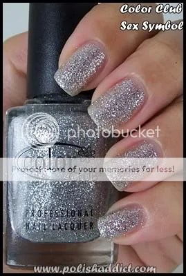
Color Club Sex Symbol is foil-y multi-sized silver glitter. I’m curious to see how this one stacks up next to the mysterious China Glaze Tinsel that we all have yet to see. All my favorite brands seem to have jumped onto the bling wagon, I’m loving every minute of it.

Color Club Magic Attraction is my favorite from this collection. Chunky holographic glitter? Um…. please, sir, can I have some more? I don’t have anything else quite like it. I suppose the closest thing would be China Glaze Let’s Do it in 3-D but the difference in glitter size creates a completely different holographic effect. Let’s Do it in 3-D is a traditional holographic with the full spectrum of color collectively flashing on the nail, while Magic Attraction has the full spectrum twinkling individually through the flecks of glitter.

My camera refused to photograph Color Club Tru Passion (below) and Sexy Siren (above) accurately. The image of Sexy Siren looks suspiciously like China Glaze Blue Sparrow but they are not similar at all. Sexy Siren is more of a turquoise blue with a touch of green.

Color Club Tru Passion is my second favorite. It’s not a mid-range purple as shown above, it’s more of amethyst or violet. Sorry for the inaccuracy, I’m still working out my photography kinks.
Special thanks to Color Club.
August 4, 2008
Lippmann Collection Fall 2008 Swatches
Sorry about that hiatus, I started a new soul-destroying job and I’ve had zero free time and zero sunlight with which to take swatch images. I’m going to invest in a light box so that I don’t have to be so sun dependent, until then, you guys will have to make due with sub-par indoor lighting.
Ok no more excuses for the moment, let’s get back to the Fall Blitzkrieg. That’s what I’ve decided to dub the insanity that is about to ensue when all the fall colors hit the shelves. It’s really like all the nail polish companies got together and conspired to empty out some bank accounts.
Here’s Lippmann Collection’s 4 new shades for fall:

Lippmann Collection Rhapsody in White is a frosty white with a tinge of silver. This is two coats in sunlight, (the only sunlight picture I was able to get today.) It’s a great color but I got a lot of noticeable brush strokes. I am not a fan of brush strokes.

Lippmann Stop and Stare is a magenta based bright jelly creme red. Gorgeous. This is 3 coats, but it’s wearable at 2 coats if you don’t mind VPL. This one had great application, not a streak in sight, smooth and perfect. I’m tempted to say that Lippmann Stop and Stare is dupish to Essie Jelly Apple, but I’m hesitant because JA is more a true red, and SaS has a magenta tone to it. I’ll do comparison swatches soon.

To be honest, I was a little surprised to see a true black in Lippmann’s fall collection. Not to hate on Lippmann, but black is black is… black. However, black is supposed to be making a come back this fall so I guess it makes sense. This is a normal, glossy, unadulterated true black creme. The application was excellent, it’s opaque in coat, but I preferred it with two. Now that I think about it, I wonder if every black really is created equal. I’ve never actually done side by side comparisons of my black cremes. My HG go-to black for layering is Milani Black Magic. It’s cheap and gets the job done so I’ve never really questioned the difference between tones, application, and wear in blacks. *light bulb goes on for article*

Lippmann Collection Pump Up the Jam is definitely the stand out color from the new Lippmann fall shades. I’m really loving these shimmery vampies. Judging by the enthusiasm for them on the nail board, I expect that vampy shimmers are going to be big this Fall. Lippmann describes this color as “Boysenberry Bijoux”. Not really sure what that means, but man, I love this color. It’s aubergine shimmer with a blackish base. This image does not do this polish justice, this one is a definite ‘must have’. I’ll definitely revisit this color for you guys when the sun comes back out, darn Florida weather.
Special thanks to Lippmann.


